Initial Webpage
Part 1, Chapter 3
Getting Starting
Getting the code examples
All of the code for this course is stored on GitLab in the following repository:
This repository is available for everyone to clone using either SSH or HTTPS:
# ssh
$ git clone [email protected]:patkennedy79/vue-crud-course-code.git

# https
$ git clone https://gitlab.com/patkennedy79/vue-crud-course-code.git
Part I (Vue Fundamentals) of this course has a corresponding branch (part1_vue_fundamentals) in the repository:
Part I (Vue Fundamentals) on GitLab
I would highly recommend following along by writing the code examples that we walk through in each chapter.
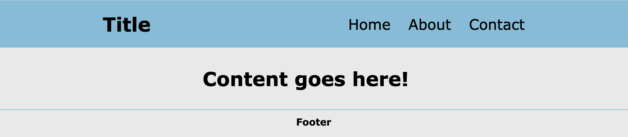
Initial Webpage
Let's start with a website that contains no JavaScript/Vue code. The goal of the starter website is to provide a canvas on which we can build Vue applications. This starter website uses HTML and CSS to create a layout that looks like this:
The structure of this project is:
$ tree
.
├── css
│   └── style.css
└── index.html
The remainder of this chapter dives into the HTML and CSS files to provide a solid foundation for the webpage structure that we're going to use throughout this course.
HTML Structure
HTML File (index.html)
The starting template for an HTML file is:
<!DOCTYPE html>
<html lang="en">
<head>
    <meta charset="UTF-8">
    <meta name="viewport" content="width=device-width, initial-scale=1.0">
    <title>Title</title>
</head>
<body>

</body>
</html>
The head section (within the <head> and </head> tags) defines metadata (data about the data!) about the HTML page. The body section (within the <body> and </body> tags) defines the contents of the HTML page using different HTML tags (<h1>, <div>, etc.).
This HTML page is defined in an HTML file: index.html
Head Section
To help with understanding the web application, I'd like to dive into the HTML for the starter website.
Start with the contents of the head section of index.html:
<head>
    <meta charset="UTF-8">
    <meta name="viewport" content="width=device-width, initial-scale=1.0">
    <title>Vue CRUD Course</title>

    <!-- Local CSS file for styling the application -->
    <link rel="stylesheet" href="css/style.css">
</head>
The head section provides a few key items for the webpage. The first <meta> tag tells the web browser reading index.html to use UTF-8 character encoding (recommended approach in the HTML5 specification). The second <meta> tag is more complex, but it's needed for building a responsive web application (i.e., a website that looks good on your laptop and your phone!).
Next, a title (Vue CRUD Course) is specified, which will show up as the name of the tab in your web browser.
Finally, there is a link to a CSS (Cascading Style Sheet) file which is where we will be writing the CSS code to style the website.
Body Section
The next section is known as the body section, as it's the code within the <body> and </body> tags:
<body>
    <header>
        <div class="title">
            <h1>Title</h1>
        </div>
        <nav>
            <ul>
                <li>Home</li>
                <li>About</li>
                <li>Contact</li>
            </ul>
        </nav>
    </header>

    <main>
        <h1>Content goes here!</h1>
    </main>

    <footer>
        <h4>Footer</h4>
    </footer>
</body>
The body of the webpage defines the three key sections of the webpage:
- Header (Title and Navigation Links)
- Main
- Footer
CSS
The style.css file is where all of the CSS (Cascading Style Sheets) code is located. The index.html file provides the content that is going into the website while the style.css file defines the styling/look of the website.
Recommendation: I recommend downloading the CSS file (style.css) from the GitLab repository to allow the styling of your project to match the content in this course: (Vue CRUD Course Code - Part I - style.css)
Overall Styling
The first section of style.css provides a few styles to apply to all HTML elements by using * wildcard:
* {
  box-sizing: border-box;
  padding: 0;
  margin: 0;
}
This is effectively a reset on the styling for each element to get to a common starting point for styling different elements.
The second section of style.css provides the styling for the <body> element, which applies the styling to the entire webpage. These styles define a background color to be an off-white ("linen") color with a font color of black:
body {
  background-color: #E9E9E9;
  color: black;
  font-family: Verdana, sans-serif;
}
Header Styling
The next section of style.css provides the styling for the header:
header {
  margin: auto;
  padding: 20px;
  background-color: #88BBD6;
  display: flex;
  flex-direction: row;
  justify-content: space-around;
}
The header has a blue-ish background color with some padding applied to give the header an appropriate size.
CSS Flexbox is used to arrange the items in the header:
header {
  display: flex;
  flex-direction: row;
  justify-content: space-around;
}
CSS Flexbox is excellent for organizing elements in rows or columns. Here, CSS Flexbox is arranging the title and navigation links in a single row with the space-around the elements providing the padding.
It's always important to define the layout of the webpage for both devices with larger screens (tablets, laptops, desktops) and mobile devices (phones) with smaller screens.
Since the users of your website could be viewing your site from any type of device, it's important to consider the layout of your website for all screen types.
The use of media queries for changing the layout of different-sized screens is a powerful tool for making your site look good on all device screen sizes.
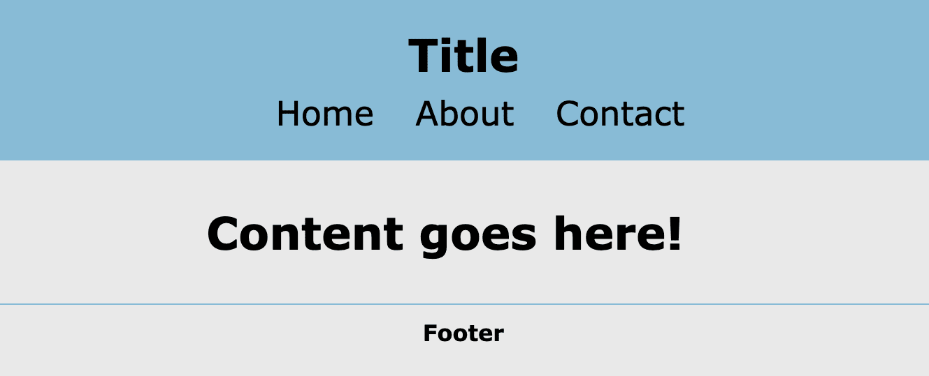
Since the header elements could end up getting squished together on smaller screen sizes, a media query is utilized to arrange the header elements in a column when the screen size is less than 700 pixels:
@media screen and (max-width: 700px) {
  header {
    flex-direction: column;
  }
}
This results in a mobile view with the title and navigation links arranged in a column:
Additional Styling
The main section is styled to center the content (margin: 0 auto;):
/*** Main Style ***/
main {
  margin: 0 auto;
  max-width: 400px;
  padding: 1em;
}
The footer section is styled to center the text (text-align: center;) and to include a line (border-top: 1px solid #88BBD6;) to distinguish the footer from the main content:
/*** Footer Style ***/
footer {
  text-align: center;
  border-top: 1px solid #88BBD6;
  padding: 10px;
}
These three sections (header, main, footer) will be utilized throughout this course as the top-level layout of the application.
✓ Mark as Completed