 Austin Johnston
The intent of this article is to expose the power behind CSS Grid. You'll learn how to create grid-based layouts through a practical, example-based approach.
Contents
Audience
This is a beginner to intermediate-level tutorial for frontend developers that have an understanding of:
- Basic CSS
- Popular CSS layout methods and solutions
- Pitfalls of other CSS layout methods
Objectives
By the end of this tutorial, you will be able to:
- Explain common CSS layout methods and solutions
- Describe how CSS Grid works and how it compares to other CSS layout methods
- Identify concepts and properties used to make CSS Grid more powerful by example
- Implement CSS Grid for two-dimensional layouts
CSS Grid and Other Layout Methods
By touching on other layout methods we can get insight into why grid has gained such traction, how and when to use it, and also ways it can enhance user experience across devices.
Here's a brief summary of all the ways to create and manipulate web page/application layouts.
| Method | Description |
|---|---|
| Normal flow | How browsers normally handle layout (no CSS) |
| The display property | Values of this property are used to create application layout: inline, block, flex, grid |
| Flexbox | One-dimensional layouts with rows and columns |
| Grid | Two-dimensional layouts with rows and columns along with explicitly placed items |
| Floats | Changes behavior of floated items and the block elements that follow |
| Positioning | Moves elements from the normal flow to a specific location: absolute, fixed, relative |
| Table layout | HTML table markup in CSS |
| Multiple-column layout | Much like multi-column articles in newspapers |
Obviously, the main focus here will be on CSS Grid, but it's important to note that many of these methods work really well -- and well together, for that matter -- for specific cases. Grid semi-recently got some amazing browser compatibility updates. With this adoption comes an opportunity for developers to utilize overlooked CSS features such as calc() and minmax() methods, and thefr measurement. We'll touch on these later
To start, let's take a quick dip into the CSS Grid ecosystem.
CSS Grid basics
To use CSS Grid, the CSS style property of display must be set to grid. This is used to manage layouts in 2D with rows and columns. It can be nested above or below any other display property. It's extremely dynamic and powerful, especially when an application's layout is complex.
Keywords
Being able to understand the components that make up the CSS Grid environment will ensure the path of least resistance when implementing complex layouts from concept to completion. There are many ways to achieve the same result with CSS Grid, so having an understanding of the ecosystem, concepts, and the keywords that define them will award you better decision making and more freedoms when moving forward with CSS Grid.
Grid can be hard to visualize when you're just getting familiar with it. Figuring out what the browser's implicit grid algorithm is doing versus your explicit styles can create a lot of confusion. Pinpointing defined areas, manipulating content, or knowing what tracks and cells are doing what, where, and why can be overwhelming. Further, we're creating a system that's hard to see, or inspect, without knowing the right tools for the job. When tackling my 'Journey to the Center of the Grid,' the browser Dev Tools opened my eyes to the importance of understanding the concepts surrounding the keywords listed above.
Lets get started by reviewing the following keywords.
- grid container
- grid track
- grid line
- grid cell
- grid item
- grid area
- grid gap
These keywords will help us grasp what's actually happening when implementing particular grid properties. We'll go over the specific properties and values used below in the next section after we establish an understanding of the core concepts.
The CodePen links that follow each item don't just show the code and resulting output -- there's explanations displayed in the code's output to help better grasp concepts. Feel free to fork and play around with any examples linked in the article.
Grid Container
A grid container is an HTML element with a CSS property of display set to a value of grid. All direct child elements will have CSS grid layout rules applied from its parent container. If they are not direct, parent containers are either unaware, don't care, or have abandoned their children (they're unaware). By only setting display to grid, you're opting into micro-managing your direct child elements. You'd have to be explicit with each element to manipulate layout styles. This makes the grid implicit. Let's nail down some keywords then we'll get explicit with our parent container and let it do all the delegation.
See the Pen yWQZJV by Michael Herman (@mjhea0) on CodePen.
Grid Lines
The row and column structure is guided by the lines that divide them up. Those lines are called grid lines, and they that make up the grid track. This is important to know because you can explicitly tell the parent where to start and end specific children. There's a pun there somewhere. Also, grid lines are ordered from the left to right, and from top to bottom and start with 1, not 0. Vertical and horizontal line groups have separate number lines, so row lines start at the top with number 1, and the columns start on the left with their own number 1. A two column, two row grid system will give you three vertical lines and three horizontal lines. Top to bottom, lines 1, 2, and 3, and separately left to right, lines 1, 2, and 3.
See the Pen YbRBJo by Michael Herman (@mjhea0) on CodePen.
Grid Tracks
This is the space between two grid lines as defined by the explicit grid properties. Essentially, whole rows or columns. To get explicit with the parent, use properties that start with grid-template-_____ or the shorthand grid on the grid container element. Grid tracks make it easy for the parent to delegate directions to the children grid items -- e.g, where to be and how to act.
See the Pen GawemN by Michael Herman (@mjhea0) on CodePen.
Grid Cells
The smallest unit of a grid. When you establish your rows and/or columns, the rectangles created by these grid tracks and grid lines create a grid cell. We'll demo this with grid items below.
Grid Items
Each direct child of a grid container is a grid item. They're always placed in a grid cell, explicitly or implicitly. Items can be one or many, and can double as a container themselves with its own children having a different set of grid rules applied.
If rows and/or columns are not established by the parent, the children are manipulated by uncle Al -- aka the auto-place algorithm. Eek
See the Pen joQRjP by Michael Herman (@mjhea0) on CodePen.
Grid Gap
A grid gap is the space placed between two grid cells. The gap property, or grid-gap in some browsers, is short-hand for the grid-row-gap and grid-column-gap properties. Nothing can be placed into the gap with grid. We'll demo this with grid area below.
Grid Areas
My favorite! Grid areas are one or more grid cells that make up a rectangular area in the parent grid container. They allow you to use text to name and organize your grid items within a grid container. Do this by applying the grid-area: <name here> property on the specified grid item or grid child. You can name each grid item with text, then line them up how you want within the parent grid container. As for the values of the property grid-template-areas set on the parent, each set of quotes counts as a row. Column names are space separated within each quotation set. You can use all the spaces you need between column names to make it look nice. If you want a blank or unnamed space, use a period, .. You can have as many of those as you want, as well, as you'll see in the demo below.
This example also shows nested grids.
See the Pen NVEVod by Michael Herman (@mjhea0) on CodePen.
Next we'll go over properties and values in more depth. For the finale, we're going to demonstrate some interesting and complex examples. But first, here's a tip.
Tip: Dev Tools
Chrome:
You can inspect grid layouts using Inspector Mode in Chrome's DevTools. To turn on Inspector Mode just press CMD+SHIFT+C (Mac) or CTRL+SHIFT+C (Windows and Linux), which is a keyboard shortcut to toggle your browser's DOM inspector tool on or off.
This is helpful with CSS Grid because when you hover over a grid container you're shown its structure. This includes tracks and cells, which make up columns and rows, as well as, margins, padding, gaps. You can also manipulate the CSS right in the DevTools to test changes without commitment. This is a great place to learn the workings of CSS Grid.
Firefox:
Want a top notch inspector experience? Firefox's Developer Tools has a Grid Inspector feature that is far superior to any other browser's at the moment. The Layout section lists all grid containers displayed in the DOM. It allows you to select one, two, or all containers and toggle the grid lines, their numbers, grid areas and names, right in the browser.
For more, check out the following resources:
Properties and Values
We'll briefly go over two sets of properties followed by values and functions that will be used with said properties.
The properties below are the most common and practical ways to manipulate a grid layout. They are very powerful and easy to implement. Using the third property below -- the grid shorthand -- is great, but I believe you'll sacrifice a bit of readability for your future self and fellow developers. Start off with the first two if you're new to the grid gang. You can use just about any size value/unit measurement to make them explicit. We'll go over some good ones shortly.
Hint: you can set the property to
noneto let the browser do the work implicitly or override values from competing media-query.
grid-template-columnsdefines the size and number of columns in a grid container.grid-template-rowsdefines the size and number of rows in a grid container.gridorgrid-template(depending on browser) is a shorthand for the two above.grid: < grid-template-rows > / < grid-template-columns >.
And now for an example, which should look familiar.
See the Pen YbRBJo by Michael Herman (@mjhea0) on CodePen.
Next, let's look at some properties that allow grid lines as guides for your layout.
Utilizing the following properties is a great way to customize your grid container's look by creating grid areas (unnamed). The style will be applied to the grid item itself, the child of a grid container. They mimic grid-template-areas mentioned in the "Grid Area" section above, just with a different syntax. If you're just starting to create grid areas this is a great place to start. The grid-template-areas syntax can be beautiful and elegant, yet it can get kind of funky fast for first timers. Have a good understanding of grid lines? These are your properties.
grid-column-start
- Identifies where a grid item (the child of grid container) starts in regards to its relative grid lines (the y-axis).
- Should be applied to a grid container's child element(s).
- Defines a grid area (an area that spans over one grid cell).
1is the left edge of the grid container.
grid-column-end
- Identifies where a grid item ends in regards to its relative grid lines.
- Should be applied to a grid container's child element(s).
- Defines a grid area.
grid-row-start
- Identifies where a grid item starts in regards to its relative grid lines (x-axis).
- Should be applied to grid container's child element(s) and value is an integer.
1is the top of the grid container.- Defines a grid area.
grid-row-end
- Identifies where a grid item ends in regards to its relative grid lines.
- Should be applied to grid container's child element(s) and value is an integer.
- Defines a grid area.
See the Pen YbRBJo by Michael Herman (@mjhea0) on CodePen.
Now, let's see some helpful units of measurement and CSS functions.
The following are very useful values to make your power CSS Grid and its properties even more dynamic and forgiving. The functions below can be used alone or as one or more values in a multi-value accepting property.
Measurement Units
rem (short for "root em")
This measurement is great! It's very forgiving on screens where users have applied accessibility by setting their browser's font size larger. This measurement unit creates lengths and sizes based on the root element's font size.
fr (short for "fraction")
This defines a unit of space available within a grid container. It allows you to divide the available space in a container by simple fractions. Fractions help avoid values of say, 66.66%. Most useful when applied to grid-template-rows and/or grid-template-columns.
fr can be used either by itself or combined:
grid-template-columns: 1fr;equals the whole container to one column. Think of it as 1/1.grid-template-columns: 1fr 1fr;will divide the container into two evenly spaced columns. Think 1/2. If you add up all the values you get the denominator and the actual values can be seen as the numerator.grid-template-columns: 1fr 3fr;will divide the container into four fractions: the first column will be 1 fraction, the second will be the remaining 3 fractions.grid-template-columns: 1fr 1fr 1fr;will divide the container into three evenly spaced columns. See the grid lines CodePen example.
CSS Functions
minmax
minmax() is a very useful CSS function that takes two arguments: First the min, then the max. It's most useful with widths and heights, but it defines any size range. It can be used for simple media queries and the units, used as parameters, can have mixed measurements, such as minmax(1fr, 25%), minmax(auto, 25%), and minmax(10rem, max-content).
See the Pen RmEwKa by Michael Herman (@mjhea0) on CodePen.
repeat
repeat() is a shorthand function that allows you to repeat a given unit of measurement. It can be used alone or with other sizing declarations. It can also have multiple second arguments that are space separated -- not comma separated, in other words -- and will repeat that group of values consecutively.
See the Pen VOqwye by Michael Herman (@mjhea0) on CodePen.
calc
calc() calculates specified equations of values. This is very powerful. In fact, it's nearly impossible to find a more efficient way to do these calculations, especially with mixed units. It uses addition, subtraction, multiplication, and division. You can nest the calc() function if necessary, too. If using it for font sizes, it's best to specify one unit as a relative length unit, like rem or vw. At the moment, there is no preprocessor that will be able to perform like native calc() since it happens at render time.
See the Pen xNmbrR by Michael Herman (@mjhea0) on CodePen.
Finally, let's look at an example CodePen project that uses all the properties and values from above. There's a lot going on, so play around with values and properties. Check your understanding. Happy Hacking!
Don't worry about the JavaScript section in this CodePen. It's used to make the
remunit match the CodePen display's root element rather than the browser's root element.
See the Pen oRJgpe by Michael Herman (@mjhea0) on CodePen.
CSS Grid Examples
Here are some examples that I hope will help you grasp the CSS Grid concepts and also understand the power it yields.
Example 1: "Blank TV - No Connection"
Gird containers are very powerful, but think of all the things you can do with a grid on top of a grid with a grid container's position set to absolute. The following CodePen shows examples of the grid-template-area, grid-template-rows, and grid-template-columns properties along with fr and repeat. It utilizes two grid containers layered on top of each other. One container has a position of absolute to layer it atop the main container.
See the Pen TV No Signal Screen - CSS Grid by Michael Herman (@mjhea0) on CodePen.
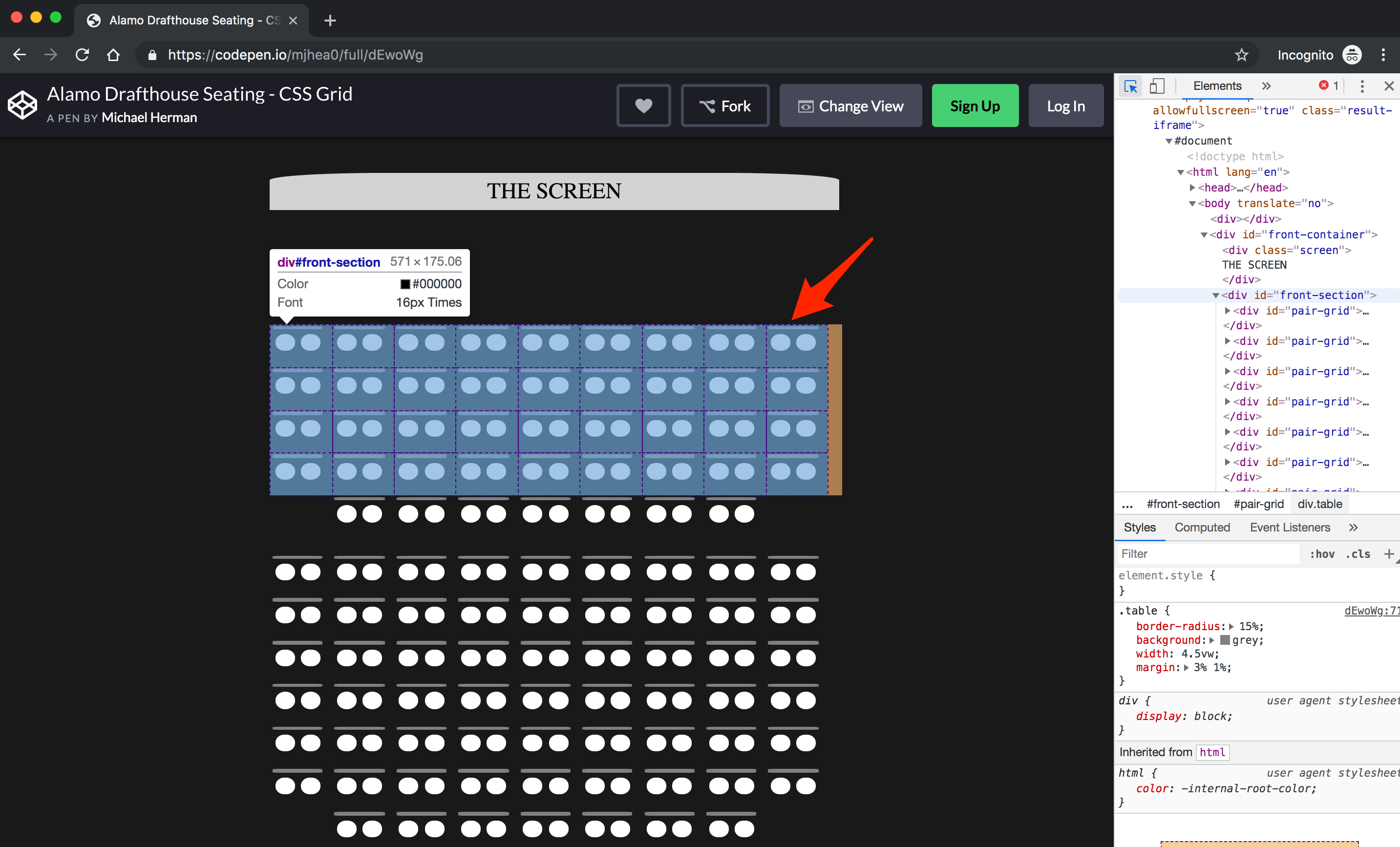
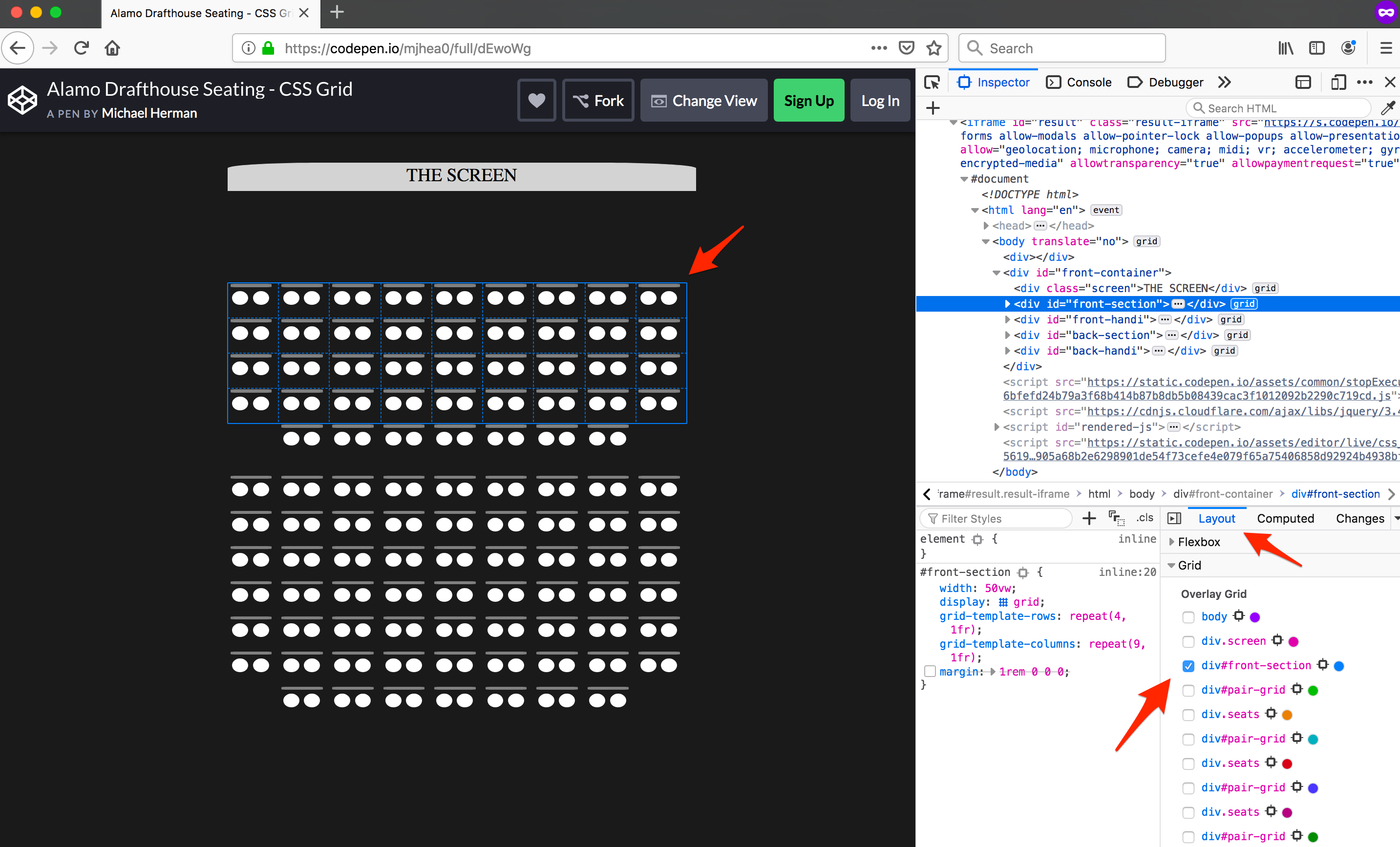
Example 2: "Alamo Drafthouse - Seating Chart"
Have you ever been to Alamo Drafthouse? It's a movie theater. It's great. Anyways, if you book online, there's a nifty little seating chart to choose from. The following example mimics that layout. It uses multiple nested grids and grid lines to shift the last rows center. There's some jQuery in the JavaScript section that just clones the seats for each section, but that just saves us from a very jumbled HTML section.
See the Pen Alamo Drafthouse Seating - CSS Grid by Michael Herman (@mjhea0) on CodePen.
Example 3: "Application Layout - responsive"
This example is a basic web app layout with nested grids. It includes a header, nav, body, and footer. The main content area is scrollable and has articles with images, as well, which uses float.
There are two break-points that shift the grid layouts. There's examples of grid-template-areas, grid-template-rows, grid-template-columns, grid, and gap.
See the Pen ZNVGja by Michael Herman (@mjhea0) on CodePen.
Conclusion
CSS Grid is awesome and powerful. Being able to have control over rows and columns bringing you two-dimensions is stellar. It's an incredible tool to have, but you should always have a whole bag of tricks when going to work on a live project. Grid, when coupled with the properties and values above, will get you far with ease when creating design templates or mockups. I've found myself reaching for grid even when I'm using a CSS Framework that includes layout helpers, such as Bootstrap, and have found it way easier, quicker, and more flexible. Go check out CodePen and search CSS Gird and see what cool projects you can learn from!