 Michael Yin
Welcome to part 2. In the first part of this tutorial series, we set up Django, configured python-webpack-boilerplate, and used Stimulus and Tailwind CSS to build reusable modal and tab components. In this second part, we'll look at how to use django-viewcomponent to build server-side components, which can help us reuse the code in a more efficient way.
Series:
- Part 1 - focuses on the project setup along with the client-side
- Part 2 (this tutorial!) - focuses on the server-side
If frontend tools and technologies isn't really your thing, and you want to keep it simple, check out Building Reusable Components in Django, which deals only with building server-side UI components with Django.
Contents
Modal Component
If we take a look at the modal component HTML, there's still some extra HTML we need to input if we want to add a modal to our page each time:
<div data-controller="modal">

  <!-- Modal toggle -->
  <button data-action="click->modal#openModal" class="btn-blue" type="button">
    Toggle modal
  </button>

  <div data-modal-target="container" tabindex="-1" aria-hidden="true" class="hidden modal-container">
    <div class="relative p-4 w-full max-w-2xl max-h-full">

      <div class="modal-content">
        <!-- Modal header -->
        <div class="modal-header">
          <h3>
            Modal Title
          </h3>
        </div>

        <!-- Modal body -->
        <div class="modal-body">
          <p class="text-base leading-relaxed text-gray-500">
            Lorem ipsum dolor sit amet, consectetur adipiscing elit. Integer in lectus et ipsum eleifend consequat. Aenean
            pellentesque tortor velit, non molestie ex ultrices in. Nulla at neque eu nulla imperdiet mattis vel sit amet
            neque. In ac mollis augue, ac iaculis purus. Donec nisl massa, gravida pharetra euismod nec, ultrices ut quam.
            Vivamus efficitur bibendum hendrerit. In iaculis sagittis elementum. Sed sit amet dolor ultrices, mollis nisl
            sed, cursus eros. Suspendisse sollicitudin quam nulla, at dignissim ex scelerisque non. Mauris ac porta nisl.
          </p>
        </div>

        <!-- Modal footer -->
        <div class="modal-footer">
          <button data-action="click->modal#closeModal" type="button" class="btn-blue">
            Close
          </button>
        </div>

      </div>
    </div>
  </div>
</div>
Can we reuse some of the template code and only pass the header, body, and footer content to the template?
We can use django-viewcomponent to help with this.
django-viewcomponent
django-viewcomponent is a Django library that provides a way to create reusable components for your Django project.
First time with django-viewcomponent? Check out Building Reusable Components in Django.
Add it to the requirements.txt file:
django-viewcomponent==1.0.5
Install:
(venv)$ pip install -r requirements.txt
Then add the app to INSTALLED_APPS in settings.py:
INSTALLED_APPS = [

    ...

    "django_viewcomponent",
]
Modify the TEMPLATES section of settings.py like so:
TEMPLATES = [
    {
        "BACKEND": "django.template.backends.django.DjangoTemplates",
        "DIRS": ["django_component_app/templates"],
        "APP_DIRS": False,  # updated
        "OPTIONS": {
            "context_processors": [
                "django.template.context_processors.debug",
                "django.template.context_processors.request",
                "django.contrib.auth.context_processors.auth",
                "django.contrib.messages.context_processors.messages",
            ],
            "loaders":[(  # new
                "django.template.loaders.cached.Loader", [
                    "django.template.loaders.filesystem.Loader",
                    "django.template.loaders.app_directories.Loader",
                    "django_viewcomponent.loaders.ComponentLoader",
                ]
            )],
        },
    },
]
Update tailwind.config.js:
const Path = require("path");
const pwd = process.env.PWD;

// We can add current project paths here
const projectPaths = [
  Path.join(pwd, "./frontend/src/**/*.js"),
  Path.join(pwd, "./django_component_app/templates/**/*.html"),
  // django-viewcomponent
  Path.join(pwd, "./components/**/*.py"),          // new
  Path.join(pwd, "./components/**/*.html"),        // new
  // add js file paths if you need
];

const contentPaths = [...projectPaths];
console.log(`tailwindcss will scan ${contentPaths}`);

module.exports = {
  content: contentPaths,
  theme: {
    extend: {},
  },
  plugins: [],
}
We added Path.join(pwd, "./components/**/*.py"), and Path.join(pwd, "./components/**/*.html"), so that way the Tailwind CSS classes will be detected and added to the final CSS file.
Create a new file called components/modal/modal.py:
from django_viewcomponent import component
from django_viewcomponent.fields import RendersOneField


@component.register("modal")
class ModalComponent(component.Component):
    modal_trigger = RendersOneField(required=True)
    modal_header = RendersOneField(required=True)
    modal_body = RendersOneField(required=True)
    modal_footer = RendersOneField(required=True)

    template_name = "modal/modal.html"
Notes:
ModalComponentis a Python class that extendscomponent.Componentclass.- We used
RendersOneFieldto define a slot field for the modal component.
Create a new file called components/modal/modal.html, which is the template file for the component:
<div data-controller="modal">

  {{ self.modal_trigger.value }}

  <div data-modal-target="container" tabindex="-1" aria-hidden="true" class="hidden modal-container">
    <div class="relative p-4 w-full max-w-2xl max-h-full">

      <div class="modal-content">
        <div class="modal-header">
          {{ self.modal_header.value }}
        </div>
        <div class="modal-body">
          {{ self.modal_body.value }}
        </div>
        <div class="modal-footer">
          {{ self.modal_footer.value }}
        </div>
      </div>
    </div>
  </div>
</div>
{{ self.modal_trigger.value }} renders a slot value of the modal_trigger field.
Update django_component_app/templates/index.html:
{% load webpack_loader static %}
{% load viewcomponent_tags %}

<!DOCTYPE html>
<html lang="en">
<head>
  <meta charset="UTF-8">
  <meta name="viewport" content="width=device-width, initial-scale=1.0">
  <title>Modal Example</title>
  {% stylesheet_pack 'app' %}
  {% javascript_pack 'app' attrs='defer' %}
</head>
<body>
  {% component 'modal' as modal_comp %}
    {% call modal_comp.modal_trigger %}
      <button data-action="click->modal#openModal" class="btn-blue" type="button">
        Toggle modal
      </button>
    {% endcall %}

    {% call modal_comp.modal_header %}
      <h3>
        Modal Title
      </h3>
    {% endcall %}

    {% call modal_comp.modal_body %}
      <p class="text-base leading-relaxed text-gray-500">
        Lorem ipsum dolor sit amet, consectetur adipiscing elit. Integer in lectus et ipsum eleifend consequat. Aenean
        pellentesque tortor velit, non molestie ex ultrices in. Nulla at neque eu nulla imperdiet mattis vel sit amet
        neque. In ac mollis augue, ac iaculis purus. Donec nisl massa, gravida pharetra euismod nec, ultrices ut quam.
        Vivamus efficitur bibendum hendrerit. In iaculis sagittis elementum. Sed sit amet dolor ultrices, mollis nisl
        sed, cursus eros. Suspendisse sollicitudin quam nulla, at dignissim ex scelerisque non. Mauris ac porta nisl.
      </p>
    {% endcall %}

    {% call modal_comp.modal_footer %}
      <button data-action="click->modal#closeModal" type="button" class="btn-blue">
        Close
      </button>
    {% endcall %}
  {% endcomponent %}
</body>
</html>
Notes:
- We set
{% load viewcomponent_tags %}at the top so we can use the{% component %}tags. {% component 'modal' as modal_comp %}creates a modal component and assigns it to themodal_compvariable.{% call modal_comp.modal_trigger %}passes thecontentto themodal_triggerslot of the modal component.
To test, run the Django dev server in one terminal window:
(venv)$ python manage.py runserver
And run the webpack dev server in a different window:
$ npm run start
Navgate to http://127.0.0.1:8000/ and make sure the modal still works as expected.
Modal Size
While you're newly created server-side modal component works great, say your designer comes to you and says, "I need a bigger modal". To handle that, start by updating components/modal/modal.py like so:
from django_viewcomponent import component
from django_viewcomponent.fields import RendersOneField


@component.register("modal")
class ModalComponent(component.Component):
    modal_trigger = RendersOneField(required=True)
    modal_header = RendersOneField(required=True)
    modal_body = RendersOneField(required=True)
    modal_footer = RendersOneField(required=True)

    template_name = "modal/modal.html"

    size_map = {
        "md": "max-w-2xl",
        "lg": "max-w-4xl",
    }

    def __init__(self, size=None, **kwargs):
        self.size = size

    @property
    def size_css(self):
        # return the class based on the size, if not, return the default size
        return self.size_map.get(self.size, self.size_map["md"])
Notes:
- Now the component can accept a
sizeparameter. - We defined
size_mapto map the size to the CSS class along with asize_cssproperty to return the CSS class based on the size parameter.
Then, update components/modal/modal.html:
<div data-controller="modal">

  {{ self.modal_trigger.value }}

  <div data-modal-target="container" tabindex="-1" aria-hidden="true" class="hidden modal-container">
    <div class="relative p-4 w-full {{ self.size_css }} max-h-full m-auto">

      <div class="modal-content">
        <div class="modal-header">
          {{ self.modal_header.value }}
        </div>
        <div class="modal-body">
          {{ self.modal_body.value }}
        </div>
        <div class="modal-footer">
          {{ self.modal_footer.value }}
        </div>
      </div>
    </div>
  </div>
</div>
Object-Oriented Programming helps keep the logic in the Python class while allowing the template file to do the work that it's suppossed to do -- i.e., render the HTML.
Then in the django_component_app/templates/index.html file, we can change the modal size like so:
{% component 'modal' size='lg' as modal_comp %}

...

{% endcomponent %}
As you can see, the component is very extendable, logic has been separated from the template, and the template code is very clean and easy to read, since we do not need to write many if-else statements in the template file.
Tab Component
Next, let's create a server-side tab component.
components/tab/tab.py:
from django_viewcomponent import component
from django_viewcomponent.fields import RendersManyField


@component.register("tab")
class TabComponent(component.Component):
    tabs = RendersManyField(required=True)
    panels = RendersManyField(required=True)

    template_name = "tab/tab.html"
Here, we used RendersManyField so that the the slot field can accept a collection of items.
Add the components/tab/tab.html template:
<div data-controller="tabs">
  <div class="mb-4 border-b border-gray-200 dark:border-gray-700">
    <ul class="flex flex-wrap -mb-px text-sm font-medium text-center">
      {% for tab in self.tabs.value %}
      <li class="me-2" role="presentation">
        <button class="inline-block p-4 border-b-2 rounded-t-lg hover:text-gray-600 hover:border-gray-300 "
                data-action="click->tabs#showContent" data-tabs-target="{{ forloop.counter }}" type="button">
          {{ tab }}
        </button>
      </li>
      {% endfor %}
    </ul>
  </div>
  <div>
    {% for panel in self.panels.value %}
    <div class="hidden p-4 rounded-lg bg-gray-50 dark:bg-gray-800" data-panel="{{ forloop.counter }}" role="tabpanel">
      {{ panel }}
    </div>
    {% endfor %}
  </div>
</div>
Update django_component_app/templates/index.html:
{% load webpack_loader static %}
{% load viewcomponent_tags %}
<!DOCTYPE html>
<html lang="en">
<head>
<meta charset="UTF-8">
<meta name="viewport" content="width=device-width, initial-scale=1.0">
<title>Tab Example</title>
{% stylesheet_pack 'app' %}
{% javascript_pack 'app' attrs='defer' %}
</head>
<body>
{% component 'tab' as component %}
{% call component.tabs %}
Profile
{% endcall %}
{% call component.panels %}
<p class="text-sm text-gray-500 dark:text-gray-400">This is some placeholder content the <strong
class="font-medium text-gray-800 ">Profile tab's associated content</strong>. Clicking
another tab will toggle the visibility of this one for the next. The tab JavaScript swaps classes to control the
content visibility and styling.</p>
{% endcall %}
{% call component.tabs %}
Dashboard
{% endcall %}
{% call component.panels %}
<p class="text-sm text-gray-500 dark:text-gray-400">This is some placeholder content the <strong
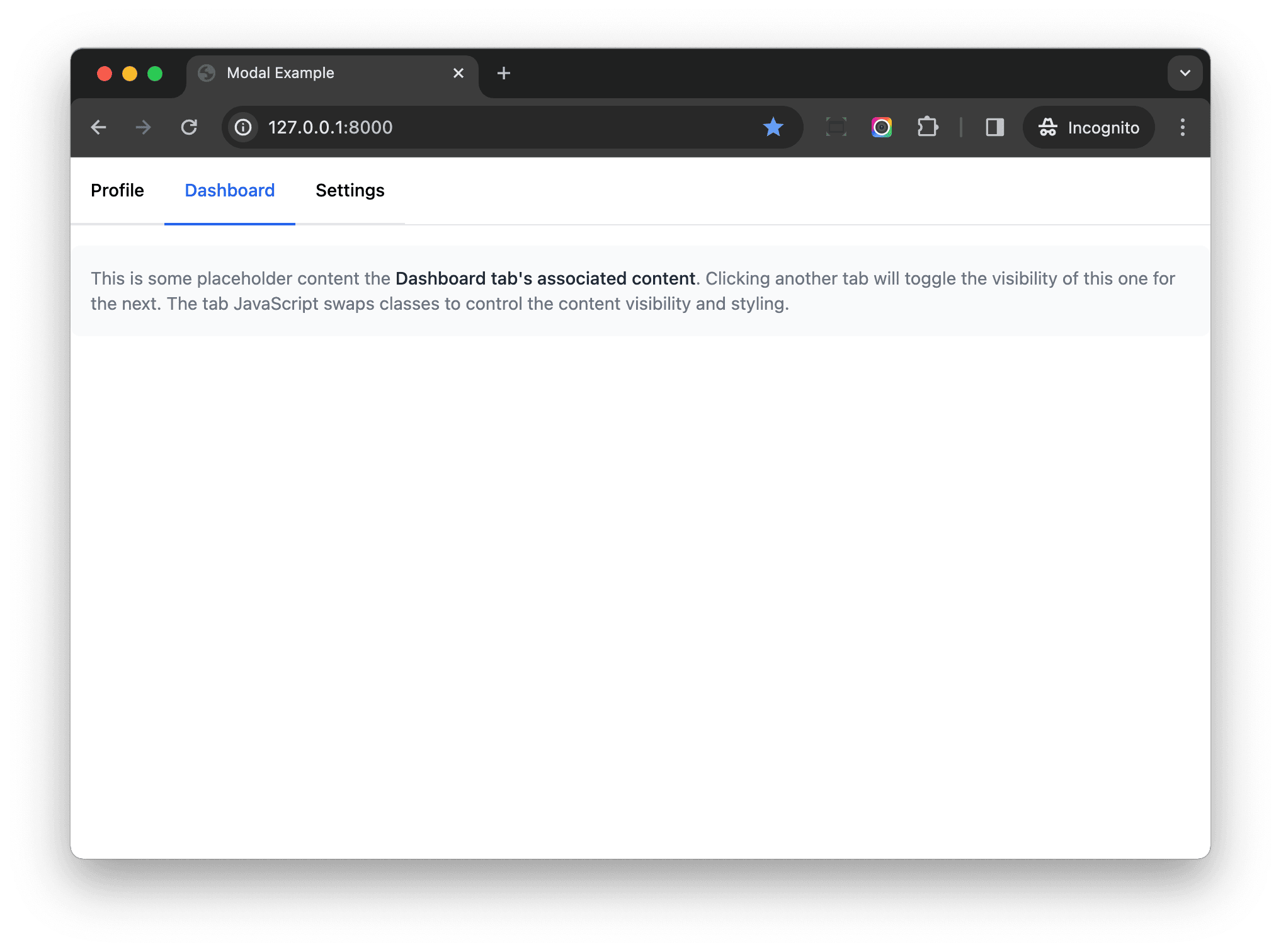
class="font-medium text-gray-800 ">Dashboard tab's associated content</strong>. Clicking
another tab will toggle the visibility of this one for the next. The tab JavaScript swaps classes to control the
content visibility and styling.</p>
{% endcall %}
{% call component.tabs %}
Settings
{% endcall %}
{% call component.panels %}
<p class="text-sm text-gray-500 dark:text-gray-400">This is some placeholder content the <strong
class="font-medium text-gray-800 ">Settings tab's associated content</strong>. Clicking
another tab will toggle the visibility of this one for the next. The tab JavaScript swaps classes to control the
content visibility and styling.</p>
{% endcall %}
{% endcomponent %}
</body>
</html>
Notes:
- We put the tab content and the respective panel content together, to make the code more readable.
RendersManyFieldis a powerful feature. It allows us to define a slot field, and pass content to the component slot multiple times.
Conclusion
In this article, we moved the HTML for our components to the server-side. The server-side components make the code more maintainable, reusable, and testable. I hope it can help you build a better Django project.
If you want to know more about django-viewcomponent, review the official documentation. I also encourage you to check out the following sections from the Building Reusable Components in Django article:
Series:
- Part 1 - focuses on the project setup along with the client-side
- Part 2 (this tutorial!) - focuses on the server-side