 Michael Yin
In this tutorial, we'll look at how to build UI components in your full-stack Django app, which can help you reuse code (frontend and backend) and keep your code clean and maintainable.
This tutorial series deals with both the frontend and backend components in Django, covering the following tools and technologies:
Series:
- Part 1 (this tutorial!) - focuses on the project setup along with the client-side
- Part 2 - focuses on the server-side
If frontend tools and technologies isn't really your thing, and you want to keep it simple, check out Building Reusable Components in Django, which deals only with building server-side UI components with Django.
Contents
Project Setup
Django Project
Create a new project directory along with a new Django project:
$ mkdir django-component-example && cd django-component-example
$ python3.12 -m venv venv
$ source venv/bin/activate
(venv)$

(venv)$ pip install Django==5.0.6
(venv)$ django-admin startproject django_component_app .
(venv)$ python manage.py migrate
(venv)$ python manage.py runserver
Feel free to swap out virtualenv and Pip for uv, Poetry, or Pipenv. For more, review Modern Python Environments.
Navigate to http://127.0.0.1:8000/ to view the Django welcome screen. Kill the server once done.
Create a requirements.txt file and add Django as a dependency:
Django==5.0.6
python-webpack-boilerplate
Next, in order to work with modern frontend tools and technologies, we'll add python-webpack-boilerplate. After setting it up, we'll be able to import Tailwind CSS, Stimulus JS, and other modern frontend libraries via npm install without adding CDN links to your templates.
Add it to requirements.txt:
python-webpack-boilerplate==1.0.3
And then install the package:
(venv)$ pip install -r requirements.txt
Add it to INSTALLED_APPS in django_component_app/settings.py:
INSTALLED_APPS = [
    "django.contrib.admin",
    "django.contrib.auth",
    "django.contrib.contenttypes",
    "django.contrib.sessions",
    "django.contrib.messages",
    "django.contrib.staticfiles",

    "webpack_boilerplate", # new
]
To init a new frontend project, run the following management command:
(venv)$ python manage.py webpack_init

[1/2] project_slug (frontend): frontend
[2/2] run_npm_command_at_root (y): y
[SUCCESS]: Frontend app 'frontend' has been created.
Notes:
- A new "frontend" directory was created, which contains predefined files for our frontend project.
- package.json and some other config files were placed at the root directory.
- By setting
run_npm_command_at_roottoy, we can runnpmcommands directly at the root of the Django project.
Your project structure should now look like this:
├── .babelrc
├── .browserslistrc
├── .eslintrc
├── .nvmrc
├── .stylelintrc.json
├── django_component_app
│   ├── __init__.py
│   ├── asgi.py
│   ├── settings.py
│   ├── urls.py
│   └── wsgi.py
├── frontend
│   ├── .gitignore
│   ├── README.md
│   ├── src
│   │   ├── application
│   │   │   ├── README.md
│   │   │   └── app.js
│   │   ├── components
│   │   │   ├── README.md
│   │   │   └── jumbotron.js
│   │   └── styles
│   │       └── index.scss
│   ├── vendors
│   │   ├── .gitkeep
│   │   └── images
│   │       ├── .gitkeep
│   │       ├── sample.jpg
│   │       └── webpack.png
│   └── webpack
│       ├── webpack.common.js
│       ├── webpack.config.dev.js
│       ├── webpack.config.prod.js
│       └── webpack.config.watch.js
├── manage.py
├── package-lock.json
├── package.json
├── postcss.config.js
└── requirements.txt
To run the webpack dev server, start by installing Node and npm if you don't already have them installed.
You can either download them directly here or leverage nvm or fnm.
$ node -v
v20.10.0

$ npm -v
10.2.3
Next, run the following command to install the frontend dependency packages:
$ npm install
To ensure everything works, run the dev server:
$ npm run start
As long as you don't get an error, you can assume all is well. Terminate the server once done. We can now install and leverage frontend libraries such as Tailwind CSS and Stimulus JS.
Tailwind
In the root directory, run the following command:
$ npm install -D [email protected] [email protected]
Next, update postcss.config.js like so:
// https://tailwindcss.com/docs/using-with-preprocessors

module.exports = {
  plugins: {
    "postcss-import": {},
    "tailwindcss/nesting": "postcss-nesting",
    tailwindcss: {},
    "postcss-preset-env": {
      features: { "nesting-rules": false },
    },
  }
}
This configuration allows us to use Tailwind CSS with PostCSS.
Then, generate a config file for your frontend project using the Tailwind CLI utility:
$ npx tailwindcss init
You should now see a tailwind.config.js file in the project root:
/** @type {import('tailwindcss').Config} */
module.exports = {
  content: [],
  theme: {
    extend: {},
  },
  plugins: [],
}
We can update this file to customize Tailwind CSS. For now, let's leave it as it is.
Next, update frontend/src/styles/index.scss:
@import "tailwindcss/base";
@import "tailwindcss/components";
@import "tailwindcss/utilities";

.jumbotron {
  // should be relative path of the entry scss file
  background-image: url("../../vendors/images/sample.jpg");
  background-size: cover;
}

.btn-blue {
  @apply inline-flex items-center;
  @apply px-4 py-2;
  @apply font-semibold rounded-lg shadow-md;
  @apply text-white bg-blue-500;
  @apply hover:bg-blue-700 focus:outline-none focus:ring-2 focus:ring-blue-400 focus:ring-opacity-75;
}
Here, we:
- Imported Tailwind CSS
- Used classic CSS syntax to apply styles to a
jumbotronclass - Used
@applyto apply Tailwind CSS utility classes to thebtn-blueclass
Let's test again:
$ npm run start
You should see that Tailwind compiled successfully. With that, let's test things in a Django template.
Django Template
Start by adding the following to django_component_app/settings.py:
STATICFILES_DIRS = [
    str(BASE_DIR / "frontend/build"),
]

WEBPACK_LOADER = {
    "MANIFEST_FILE": str(BASE_DIR / "frontend/build/manifest.json"),
}
Notes:
- We added the "frontend/build" directory to
STATICFILES_DIRSso Django can find the static assets built by webpack. - We also defined the
MANIFEST_FILElocation toWEBPACK_LOADERso our custom loader can help us load the JS and CSS.
Review the Python Webpack Boilerplate docs to learn more.
Update django_component_app/urls.py:
from django.contrib import admin
from django.urls import path
from django.views.generic import TemplateView  # new

urlpatterns = [
    path("", TemplateView.as_view(template_name="index.html")),  # new
    path("admin/", admin.site.urls),
]
Create a new folder called "templates" inside "django_component_app". Then, update TEMPLATES in django_component_app/settings.py, so Django knows where to find the templates:
TEMPLATES = [
    {
        "BACKEND": "django.template.backends.django.DjangoTemplates",
        "DIRS": ["django_component_app/templates"],  # updated
        "APP_DIRS": True,
        "OPTIONS": {
            "context_processors": [
                "django.template.context_processors.debug",
                "django.template.context_processors.request",
                "django.contrib.auth.context_processors.auth",
                "django.contrib.messages.context_processors.messages",
            ],
        },
    },
]
Add an index.html to "django_component_app/templates":
{% load webpack_loader static %}

<!DOCTYPE html>
<html>
<head>
  <title>Index</title>
  <meta charset="utf-8" />
  <meta name="viewport" content="width=device-width, initial-scale=1.0">
  {% stylesheet_pack 'app' %}
</head>
<body>

<div class="jumbotron py-5">
  <div class="w-full max-w-7xl mx-auto px-4">
    <h1 class="text-4xl mb-4">Hello, world!</h1>
    <p class="mb-4">This is a template for a simple marketing or informational website. It includes a large callout called a
        jumbotron and three supporting pieces of content. Use it as a starting point to create something more unique.</p>

    <p><a class="btn-blue mb-4" href="#" role="button">Learn more »</a></p>

    <div class="flex justify-center">
      <img src="{% static 'vendors/images/webpack.png' %}"/>
    </div>
  </div>
</div>

{% javascript_pack 'app' %}

</body>
</html>
Here, we:
- Set
load webpack_loaderat the top of the template, which comes from python-webpack-boilerplate and providesstylesheet_packandjavascript_packtemplate tags. - Still used the Django
statictemplate tag to import images from the frontend project. - Leveraged
stylesheet_packandjavascript_packto load CSS and JS bundle files, respectively.
Review the Python Webpack Boilerplate docs to learn more.
With the webpack dev server running (via npm run start) in one terminal window, spin up the Django dev server in an a new window:
(venv)$ python manage.py migrate
(venv)$ python manage.py runserver
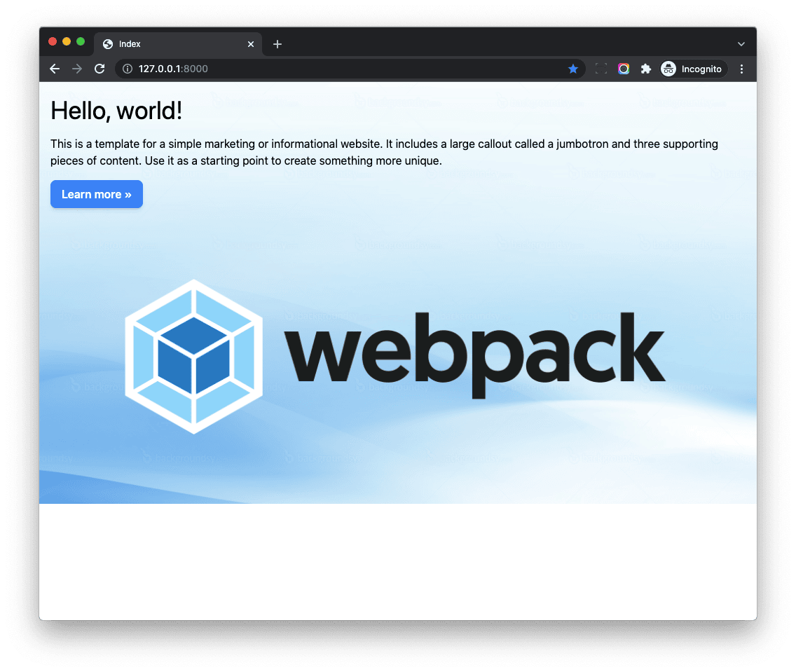
Navigate to http://127.0.0.1:8000/. You should be able to see a welcome page:

Take note that the btn-blue class is working properly while the w-full max-w-7xl mx-auto px-4 classes are not working. To get these to work, we need to let Tailwind know which CSS classes are used in our project.
JIT
Tailwind works by scanning all of your HTML, JavaScript components, and any other template files for class names, then it generates all of the corresponding CSS for those styles. In order for Tailwind to generate all of the CSS you need, it needs to know about every single file in your project that contains any Tailwind class names.
Tailwind leverages JIT (Just-in-Time) all the time since version 3.
So we should configure the content section of tailwind.config.js, so then Tailwind will know which CSS classes are used.
Update tailwind.config.js like so:
const Path = require("path");
const pwd = process.env.PWD;

// We can add current project paths here
const projectPaths = [
  Path.join(pwd, "./django_component_app/templates/**/*.html"),
  // add js file paths if you need
];

const contentPaths = [...projectPaths];
console.log(`tailwindcss will scan ${contentPaths}`);

module.exports = {
  content: contentPaths,
  theme: {
    extend: {},
  },
  plugins: [],
}
So, we added the Django templates path to projectPaths, and then passed contentPaths to content. The final built CSS file will contain CSS classes used in the Django templates.
Restart the webpack dev server:
$ npm run start
You should now see:
Live Reload
Add the following to devServer in frontend/webpack/webpack.config.dev.js to enable live reload:
watchFiles: [
  Path.join(__dirname, "../../django_component_app/**/*.py"),
  Path.join(__dirname, "../../django_component_app/**/*.html"),
],
Now, the webpack dev server will watch for changes in any .py or .html files in the "django_component_app" directory. If any code changes, the dev serer will reload automatically.
Restart webpack dev server:
$ npm run start
Finally, you can remove the "frontend/src/components" folder, since we won't be using those files in this tutorial. Also, update frontend/src/application/app.js like so:
// This is the scss entry file
import "../styles/index.scss";
Your project structure should now look like this:
├── .babelrc
├── .browserslistrc
├── .eslintrc
├── .nvmrc
├── .stylelintrc.json
├── django_component_app
│   ├── __init__.py
│   ├── asgi.py
│   ├── settings.py
│   ├── templates
│   │   └── index.html
│   ├── urls.py
│   └── wsgi.py
├── frontend
│   ├── .gitignore
│   ├── README.md
│   ├── build
│   │   ├── css
│   │   │   └── app.css
│   │   ├── frontend
│   │   │   └── vendors
│   │   │       └── images
│   │   │           └── sample.jpg
│   │   ├── js
│   │   │   ├── app.js
│   │   │   └── runtime.js
│   │   ├── manifest.json
│   │   └── vendors
│   │       ├── .gitkeep
│   │       └── images
│   │           ├── .gitkeep
│   │           ├── sample.jpg
│   │           └── webpack.png
│   ├── src
│   │   ├── application
│   │   │   ├── README.md
│   │   │   └── app.js
│   │   └── styles
│   │       └── index.scss
│   ├── vendors
│   │   ├── .gitkeep
│   │   └── images
│   │       ├── .gitkeep
│   │       ├── sample.jpg
│   │       └── webpack.png
│   └── webpack
│       ├── webpack.common.js
│       ├── webpack.config.dev.js
│       ├── webpack.config.prod.js
│       └── webpack.config.watch.js
├── manage.py
├── package-lock.json
├── package.json
├── postcss.config.js
├── requirements.txt
└── tailwind.config.js
Congratulations! You now have a Django project which uses modern frontend techs to compile frontend assets. We can now start building components!
Modal Component
Let's start by creating a modal component since it's very common in web applications.
HTML
Let's first take a look at the below code, copied from the Flowbite, a modern UI toolkit built with Tailwind CSS:
<!-- Modal toggle -->
<button data-modal-target="default-modal" data-modal-toggle="default-modal" class="block text-white bg-blue-700 hover:bg-blue-800 focus:ring-4 focus:outline-none focus:ring-blue-300 font-medium rounded-lg text-sm px-5 py-2.5 text-center dark:bg-blue-600 dark:hover:bg-blue-700 dark:focus:ring-blue-800" type="button">
  Toggle modal
</button>

<!-- Main modal -->
<div id="default-modal" tabindex="-1" aria-hidden="true" class="hidden overflow-y-auto overflow-x-hidden fixed top-0 right-0 left-0 z-50 justify-center items-center w-full md:inset-0 h-[calc(100%-1rem)] max-h-full">
  <div class="relative p-4 w-full max-w-2xl max-h-full">
    <!-- Modal content -->
    <div class="relative bg-white rounded-lg shadow dark:bg-gray-700">
      <!-- Modal header -->
      <div class="flex items-center justify-between p-4 md:p-5 border-b rounded-t dark:border-gray-600">
        <h3 class="text-xl font-semibold text-gray-900 dark:text-white">
          Terms of Service
        </h3>
        <button type="button" class="text-gray-400 bg-transparent hover:bg-gray-200 hover:text-gray-900 rounded-lg text-sm w-8 h-8 ms-auto inline-flex justify-center items-center dark:hover:bg-gray-600 dark:hover:text-white" data-modal-hide="default-modal">
          <svg class="w-3 h-3" aria-hidden="true" xmlns="http://www.w3.org/2000/svg" fill="none" viewBox="0 0 14 14">
            <path stroke="currentColor" stroke-linecap="round" stroke-linejoin="round" stroke-width="2" d="m1 1 6 6m0 0 6 6M7 7l6-6M7 7l-6 6"/>
          </svg>
          <span class="sr-only">Close modal</span>
        </button>
      </div>
      <!-- Modal body -->
      <div class="p-4 md:p-5 space-y-4">
        <p class="text-base leading-relaxed text-gray-500 dark:text-gray-400">
          With less than a month to go before the European Union enacts new consumer privacy laws for its citizens, companies around the world are updating their terms of service agreements to comply.
        </p>
      </div>
      <!-- Modal footer -->
      <div class="flex items-center p-4 md:p-5 border-t border-gray-200 rounded-b dark:border-gray-600">
        <button data-modal-hide="default-modal" type="button" class="text-white bg-blue-700 hover:bg-blue-800 focus:ring-4 focus:outline-none focus:ring-blue-300 font-medium rounded-lg text-sm px-5 py-2.5 text-center dark:bg-blue-600 dark:hover:bg-blue-700 dark:focus:ring-blue-800">I accept</button>
        <button data-modal-hide="default-modal" type="button" class="py-2.5 px-5 ms-3 text-sm font-medium text-gray-900 focus:outline-none bg-white rounded-lg border border-gray-200 hover:bg-gray-100 hover:text-blue-700 focus:z-10 focus:ring-4 focus:ring-gray-100 dark:focus:ring-gray-700 dark:bg-gray-800 dark:text-gray-400 dark:border-gray-600 dark:hover:text-white dark:hover:bg-gray-700">Decline</button>
      </div>
    </div>
  </div>
</div>
Notes:
- The top button is a toggle button to show/hide the modal.
- The buttons in the modal footer can also hide the modal.
- Flowbite includes some JavaScript that has special data attributes (
data-modal-toggle,data-modal-hide) to control the behavior of the modal. We will not be using Flowbite's JavaScript in this tutorial; we'll write our own instead.
JavaScript
Let's write some JavaScript code to make the modal work.
Update django_component_app/templates/index.html:
{% load webpack_loader static %}

<!DOCTYPE html>
<html lang="en">
<head>
  <meta charset="UTF-8">
  <meta name="viewport" content="width=device-width, initial-scale=1.0">
  <title>Modal Example</title>
  {% stylesheet_pack 'app' %}
  {% javascript_pack 'app' %}
</head>
<body>

<!-- Modal toggle -->
<button id="open-modal-button"
        class="block text-white bg-blue-700 hover:bg-blue-800 focus:ring-4 focus:outline-none focus:ring-blue-300 font-medium rounded-lg text-sm px-5 py-2.5 text-center dark:bg-blue-600 dark:hover:bg-blue-700 dark:focus:ring-blue-800"
        type="button">
  Toggle modal
</button>

<!-- Main modal -->
<div tabindex="-1" aria-hidden="true"
     id="default-modal"
     class="hidden overflow-y-auto overflow-x-hidden fixed top-0 right-0 left-0 z-50 justify-center items-center w-full md:inset-0 h-[calc(100%-1rem)] max-h-full">
  <div class="relative p-4 w-full max-w-2xl max-h-full">

    <!-- Modal content -->
    <div class="relative bg-white rounded-lg shadow">
      <!-- Modal header -->
      <div class="flex items-center justify-between p-4 md:p-5 border-b rounded-t">
        <h3>
          Modal Title
        </h3>
      </div>

      <!-- Modal body -->
      <div class="p-4 md:p-5 space-y-4">
        <p class="text-base leading-relaxed text-gray-500">
          Lorem ipsum dolor sit amet, consectetur adipiscing elit. Integer in lectus et ipsum eleifend consequat. Aenean
          pellentesque tortor velit, non molestie ex ultrices in. Nulla at neque eu nulla imperdiet mattis vel sit amet
          neque. In ac mollis augue, ac iaculis purus. Donec nisl massa, gravida pharetra euismod nec, ultrices ut quam.
          Vivamus efficitur bibendum hendrerit. In iaculis sagittis elementum. Sed sit amet dolor ultrices, mollis nisl
          sed, cursus eros. Suspendisse sollicitudin quam nulla, at dignissim ex scelerisque non. Mauris ac porta nisl.
        </p>
      </div>

      <!-- Modal footer -->
      <div class="flex items-center p-4 md:p-5 border-t border-gray-200 rounded-b">
        <button type="button"
                id="close-modal-button"
                class="py-2.5 px-5 ms-3 text-sm font-medium text-gray-900 focus:outline-none bg-white rounded-lg border border-gray-200 hover:bg-gray-100 hover:text-blue-700 focus:z-10 focus:ring-4 focus:ring-gray-100">
          Close
        </button>
      </div>
    </div>
  </div>
</div>

<script>
  document.addEventListener("DOMContentLoaded", function () {
    const openModalButton = document.getElementById('open-modal-button');
    const closeModalButton = document.getElementById('close-modal-button');
    const modal = document.getElementById('default-modal');

    openModalButton.addEventListener('click', function () {
      modal.classList.remove('hidden');
    });

    closeModalButton.addEventListener('click', function () {
      modal.classList.add('hidden');
    });

  });
</script>

</body>
</html>
Notes:
- We added an event handler for the
DOMContentLoadedevent to make sure that the DOM is loaded before we add our event listeners. - We added event listeners to show/hide the modal when the appropriate button is clicked.
- We leveraged
getElementByIdto get the modal element so that the event listeners are applied to the modal.
If you take a look at Flowbite's HTML code, it also works in a similar manner.
With the webpack and Django development servers running, you should be able to test the model on http://127.0.0.1:8000/.
While our modal works, the code is not robust, because setting up event handlers using DOMContentLoaded might bring some issues if the HTML is dynamically inserted. For example, what if the modal's HTML is loaded by AJAX after the page load?
- Github issue: help understanding HTMX behavior and JS
- HTMX/Flowbite.js initFlowbite() causes an open modal to display twice
As you can see, the solution is a little tricky and gets complicated quickly. Since the DOMContentLoaded event already fired before the component is inserted, you need to manually init the component after the HTML is dynamically inserted. It will get even more complicated if you have multiple components.
Event delegation might be a solution to this problem, but it can break the component encapsulation by handling events at a higher level, potentially leading to a less predictable and maintainable codebase.
Instead, we'll use the MutationObserver interface.
MutationObserver
We can use the MutationObserver interface to watch for changes in the DOM tree, and set up event handlers for the HTML which is dynamically inserted.
While MutationObserver offers a low-level approach to tracking DOM changes, developers often opt for higher-level abstractions provided by specialized packages. These packages simplify the process of adding interactivity and reactivity to web applications.
There are two good options for developers:
- Alpine.js - A rugged, minimal framework for composing JavaScript behavior in your markup; the syntax is similar to Vue.js.
- Stimulus - A JavaScript framework with modest ambitions. Unlike other frontend frameworks, Stimulus is designed to enhance static or server-rendered HTML -- the "HTML you already have" -- by connecting JavaScript objects to elements on the page using simple annotations.
Both of these frameworks are lightweight and user-friendly, leveraging MutationObserver at a low-level to adeptly manage dynamically inserted HTML elements.
Alpine.js is already very popular in the Django community, but Stimulus is also a good choice. In fact, the Wagtail CMS Admin UI is built with Stimulus.
We'll focus on Stimulus in this article, but you can use Alpine.js instead to achieve the same goal.
Stimulus
Update django_component_app/templates/index.html like so:
{% load webpack_loader static %}

<!DOCTYPE html>
<html lang="en">
<head>
  <meta charset="UTF-8">
  <meta name="viewport" content="width=device-width, initial-scale=1.0">
  <title>Modal Example</title>
  {% stylesheet_pack 'app' %}
  {% javascript_pack 'app' %}
</head>
<body>

<div data-controller="modal">

  <!-- Modal toggle -->
  <button data-action="click->modal#openModal" class="block text-white bg-blue-700 hover:bg-blue-800 focus:ring-4 focus:outline-none focus:ring-blue-300 font-medium rounded-lg text-sm px-5 py-2.5 text-center dark:bg-blue-600 dark:hover:bg-blue-700 dark:focus:ring-blue-800" type="button">
    Toggle modal
  </button>

  <div data-modal-target="container" tabindex="-1" aria-hidden="true" class="hidden overflow-y-auto overflow-x-hidden fixed top-0 right-0 left-0 z-50 justify-center items-center w-full md:inset-0 h-[calc(100%-1rem)] max-h-full">
    <div class="relative p-4 w-full max-w-2xl max-h-full">

      <!-- Modal content -->

      <div class="relative bg-white rounded-lg shadow dark:bg-gray-700">
        <!-- Modal header -->
        <div class="flex items-center justify-between p-4 md:p-5 border-b rounded-t dark:border-gray-600">
          <h3>
            Modal Title
          </h3>
        </div>

        <!-- Modal body -->
        <div class="p-4 md:p-5 space-y-4">
          <p class="text-base leading-relaxed text-gray-500">
            Lorem ipsum dolor sit amet, consectetur adipiscing elit. Integer in lectus et ipsum eleifend consequat. Aenean
            pellentesque tortor velit, non molestie ex ultrices in. Nulla at neque eu nulla imperdiet mattis vel sit amet
            neque. In ac mollis augue, ac iaculis purus. Donec nisl massa, gravida pharetra euismod nec, ultrices ut quam.
            Vivamus efficitur bibendum hendrerit. In iaculis sagittis elementum. Sed sit amet dolor ultrices, mollis nisl
            sed, cursus eros. Suspendisse sollicitudin quam nulla, at dignissim ex scelerisque non. Mauris ac porta nisl.
          </p>
        </div>

        <!-- Modal footer -->
        <div class="flex items-center p-4 md:p-5 border-t border-gray-200 rounded-b dark:border-gray-600">
          <button data-action="click->modal#closeModal" type="button" class="py-2.5 px-5 ms-3 text-sm font-medium text-gray-900 focus:outline-none bg-white rounded-lg border border-gray-200 hover:bg-gray-100 hover:text-blue-700 focus:z-10 focus:ring-4 focus:ring-gray-100">
            Close
          </button>
        </div>

      </div>
    </div>
  </div>

</div>

<script type="module">
  import { Application, Controller } from "https://unpkg.com/@hotwired/stimulus/dist/stimulus.js";
  const application = Application.start();
  application.register("modal", class extends Controller {
    static targets = ["container"];

    openModal() {
      this.containerTarget.classList.remove("hidden");
    }

    closeModal() {
      this.containerTarget.classList.add("hidden");
    }
  });
</script>

</body>
</html>
Notes:
- In the
scripttag, we set thetypetomodule, indicating that the script should be treated as an ECMAScript (ES) module. - We then imported Stimulus from the CDN, and registered a new Stimulus controller called
modal. - The Stimulus controller is actually a JavaScript class, and a controller instance will be created for each element that has the
data-controller="modal"attribute. - The button element has
data-action="click->modal#openModal", which means that when the button is clicked, theopenModalmethod in themodalcontroller will be called to open the modal. - Similarily, the close button has
data-action="click->modal#closeModal", which means that when the close button is clicked, thecloseModalmethod in themodalcontroller will be called to close the modal. static targets = ["container"];defines the target element in the controller, which is the modal container element. We useddata-modal-target="container"to define the target element in the HTML. The benefit of usingdata-modal-targetis that we can easily access the target element (this.containerTarget) without doing element selection.
Ensure that the modal still works in the browser.
JavaScript Component
While it's technically possible, I do not recommend putting the JavaScript code in your HTML template files:
- Potential security issues - if you put the JavaScript code in the HTML file, it's easier for attackers to inject malicious code.
- The JavaScript code cannot be easily checked by a linter; it's also not easy to read, test, or maintain.
Let's put all JavaScript code in *.js files, and see what benefits we'll get.
Start by installing Stimulus:
$ npm install --save-exact @hotwired/[email protected]
Create a new file called frontend/src/controllers/modal_controller.js:
import { Controller } from "@hotwired/stimulus";

export default class extends Controller {
  static targets = ["container"];

  openModal() {
    this.containerTarget.classList.remove("hidden");
  }

  closeModal() {
    this.containerTarget.classList.add("hidden");
  }
}
Update frontend/src/application/app.js:
// This is the scss entry file
import "../styles/index.scss";

import { Application } from "@hotwired/stimulus";
import modalController from "../controllers/modal_controller";

window.Stimulus = Application.start();
window.Stimulus.register("modal", modalController);
Here, we imported modalController and then registered it using the Stimulus.register method.
Update django_component_app/templates/index.html:
{% load webpack_loader static %}

<!DOCTYPE html>
<html lang="en">
<head>
  <meta charset="UTF-8">
  <meta name="viewport" content="width=device-width, initial-scale=1.0">
  <title>Modal Example</title>
  {% stylesheet_pack 'app' %}
  {% javascript_pack 'app' attrs='defer' %}
</head>
<body>

<div data-controller="modal">

  <!-- Modal toggle -->
  <button data-action="click->modal#openModal" class="block text-white bg-blue-700 hover:bg-blue-800 focus:ring-4 focus:outline-none focus:ring-blue-300 font-medium rounded-lg text-sm px-5 py-2.5 text-center dark:bg-blue-600 dark:hover:bg-blue-700 dark:focus:ring-blue-800" type="button">
    Toggle modal
  </button>

  <div data-modal-target="container" tabindex="-1" aria-hidden="true" class="hidden overflow-y-auto overflow-x-hidden fixed top-0 right-0 left-0 z-50 justify-center items-center w-full md:inset-0 h-[calc(100%-1rem)] max-h-full">
    <div class="relative p-4 w-full max-w-2xl max-h-full">

      <!-- Modal content -->

      <div class="relative bg-white rounded-lg shadow dark:bg-gray-700">
        <!-- Modal header -->
        <div class="flex items-center justify-between p-4 md:p-5 border-b rounded-t dark:border-gray-600">
          <h3>
            Modal Title
          </h3>
        </div>

        <!-- Modal body -->
        <div class="p-4 md:p-5 space-y-4">
          <p class="text-base leading-relaxed text-gray-500">
            Lorem ipsum dolor sit amet, consectetur adipiscing elit. Integer in lectus et ipsum eleifend consequat. Aenean
            pellentesque tortor velit, non molestie ex ultrices in. Nulla at neque eu nulla imperdiet mattis vel sit amet
            neque. In ac mollis augue, ac iaculis purus. Donec nisl massa, gravida pharetra euismod nec, ultrices ut quam.
            Vivamus efficitur bibendum hendrerit. In iaculis sagittis elementum. Sed sit amet dolor ultrices, mollis nisl
            sed, cursus eros. Suspendisse sollicitudin quam nulla, at dignissim ex scelerisque non. Mauris ac porta nisl.
          </p>
        </div>

        <!-- Modal footer -->
        <div class="flex items-center p-4 md:p-5 border-t border-gray-200 rounded-b dark:border-gray-600">
          <button data-action="click->modal#closeModal" type="button" class="py-2.5 px-5 ms-3 text-sm font-medium text-gray-900 focus:outline-none bg-white rounded-lg border border-gray-200 hover:bg-gray-100 hover:text-blue-700 focus:z-10 focus:ring-4 focus:ring-gray-100">
            Close
          </button>
        </div>

      </div>
    </div>
  </div>
</div>

</body>
</html>
Notes:
- Since the Stimulus controller takes care of the modal open and close actions, we were able to move all of the JavaScript code out of the HTML template file.
- We also moved the
appJavaScript link from the end of the body to the head element, and set thedeferattribute. Using<script src="" defer>in the head section allows for asynchronous loading of scripts without blocking the rendering of the page. This is optional but recommended. You can check JavaScript Performance – How to Improve Page Speed with async and defer to learn more.
The frontend directory structure should now look like this:
├── .gitignore
├── README.md
├── build
│   ├── css
│   │   └── app.css
│   ├── frontend
│   │   └── vendors
│   │       └── images
│   │           └── sample.jpg
│   ├── js
│   │   ├── app.js
│   │   └──  runtime.js
│   ├── manifest.json
│   └── vendors
│       ├── .gitkeep
│       └── images
│           ├── .gitkeep
│           ├── sample.jpg
│           └── webpack.png
├── src
│   ├── application
│   │   ├── README.md
│   │   └── app.js
│   ├── controllers
│   │   └── modal_controller.js
│   └── styles
│       └── index.scss
├── vendors
│   ├── .gitkeep
│   └── images
│       ├── .gitkeep
│       ├── sample.jpg
│       └── webpack.png
└── webpack
    ├── webpack.common.js
    ├── webpack.config.dev.js
    ├── webpack.config.prod.js
    └── webpack.config.watch.js
Restart the webpack dev server and test the modal in the browser again.
With Stimulus, we can make the modal controller work with different HTML elements. Now, the code can be reused and it's much easier to test.
Component Style
Let's extract the Tailwind CSS classes to a separate SCSS file to make the CSS in the Django template more readable.
Create a frontend/src/styles/components/modal.scss file:
@layer components {
  [data-controller="modal"] {
    & .modal-container {
      @apply overflow-y-auto overflow-x-hidden fixed top-0 right-0 left-0 z-50 justify-center items-center w-full max-h-full;
    }

    & .modal-content {
      @apply relative bg-white rounded-lg shadow;
    }

    & .modal-header {
      @apply flex items-center justify-between p-4 md:p-5 border-b rounded-t dark:border-gray-600;
    }

    & .modal-body {
      @apply p-4 md:p-5 space-y-4;
    }

    & .modal-footer {
      @apply flex items-center p-4 md:p-5 border-t border-gray-200 rounded-b dark:border-gray-600;
    }
  }
}
Import the modal styles into frontend/src/styles/index.scss:
@import "tailwindcss/base";
@import "tailwindcss/components";
@import "tailwindcss/utilities";
@import "components/modal";  // new

.jumbotron {
  // should be relative path of the entry scss file
  background-image: url("../../vendors/images/sample.jpg");
  background-size: cover;
}

.btn-blue {
  @apply inline-flex items-center;
  @apply px-4 py-2;
  @apply font-semibold rounded-lg shadow-md;
  @apply text-white bg-blue-500;
  @apply hover:bg-blue-700 focus:outline-none focus:ring-2 focus:ring-blue-400 focus:ring-opacity-75;
}
Update django_component_app/templates/index.html:
{% load webpack_loader static %}

<!DOCTYPE html>
<html lang="en">
<head>
  <meta charset="UTF-8">
  <meta name="viewport" content="width=device-width, initial-scale=1.0">
  <title>Modal Example</title>
  {% stylesheet_pack 'app' %}
  {% javascript_pack 'app' attrs='defer' %}
</head>
<body>

<div data-controller="modal">

  <!-- Modal toggle -->
  <button data-action="click->modal#openModal" class="btn-blue" type="button">
    Toggle modal
  </button>

  <div data-modal-target="container" tabindex="-1" aria-hidden="true" class="hidden modal-container">
    <div class="relative p-4 w-full max-w-2xl max-h-full">

      <div class="modal-content">
        <!-- Modal header -->
        <div class="modal-header">
          <h3>
            Modal Title
          </h3>
        </div>

        <!-- Modal body -->
        <div class="modal-body">
          <p class="text-base leading-relaxed text-gray-500">
            Lorem ipsum dolor sit amet, consectetur adipiscing elit. Integer in lectus et ipsum eleifend consequat. Aenean
            pellentesque tortor velit, non molestie ex ultrices in. Nulla at neque eu nulla imperdiet mattis vel sit amet
            neque. In ac mollis augue, ac iaculis purus. Donec nisl massa, gravida pharetra euismod nec, ultrices ut quam.
            Vivamus efficitur bibendum hendrerit. In iaculis sagittis elementum. Sed sit amet dolor ultrices, mollis nisl
            sed, cursus eros. Suspendisse sollicitudin quam nulla, at dignissim ex scelerisque non. Mauris ac porta nisl.
          </p>
        </div>

        <!-- Modal footer -->
        <div class="modal-footer">
          <button data-action="click->modal#closeModal" type="button" class="btn-blue">
            Close
          </button>
        </div>

      </div>
    </div>
  </div>
</div>

</body>
</html>
Notes:
- With the
modal-header,modal-body, andmodal-footerCSS classes, we can use these across our application to easily generate consistent modals. - If we need to update the modal style in the future, we can just update the modal.scss file.
- Plus, our component will work even if the HTML is dynamicaly inserted onto the page.
Tab Component
Next, let's create an interactive tab component.
frontend/src/controllers/tabs_controller.js:
import { Controller } from "@hotwired/stimulus";

export default class extends Controller {
  connect() {
    this.showTab(1);
  }

  showTab(tabIndex) {
    const targetId = tabIndex.toString();
    const contentTargets = this.element.querySelectorAll("[data-panel]");
    const tabTargets = this.element.querySelectorAll("[data-tabs-target]");

    contentTargets.forEach(content => {
      content.classList.toggle("hidden", content.dataset.panel !== targetId);
    });

    tabTargets.forEach(tab => {
      const selected = tab.getAttribute("data-tabs-target") === targetId;
      tab.classList.toggle("text-blue-600", selected);
      tab.classList.toggle("border-blue-600", selected);
    });
  }

  showContent(event) {
    const targetId = event.currentTarget.getAttribute("data-tabs-target");
    this.showTab(parseInt(targetId));
  }
}
Update tailwind.config.js:
const Path = require("path");
const pwd = process.env.PWD;

// We can add current project paths here
const projectPaths = [
  Path.join(pwd, "./frontend/src/**/*.js"),          // new
  Path.join(pwd, "./django_component_app/templates/**/*.html"),
  // add js file paths if you need
];

const contentPaths = [...projectPaths];
console.log(`tailwindcss will scan ${contentPaths}`);

module.exports = {
  content: contentPaths,
  theme: {
    extend: {},
  },
  plugins: [],
}
We added Path.join(pwd, "./frontend/src/**/*.js") so that the Tailwind class names used in the above controller will be detected and added to the final CSS file.
Update frontend/src/application/app.js to register the Tab controller:
// This is the scss entry file
import "../styles/index.scss";

import { Application } from "@hotwired/stimulus";
import modalController from "../controllers/modal_controller";
import tabsController from "../controllers/tabs_controller";  // new

window.Stimulus = Application.start();
window.Stimulus.register("modal", modalController);
window.Stimulus.register("tabs", tabsController);       // new
Update django_component_app/templates/index.html:
{% load webpack_loader static %}

<!DOCTYPE html>
<html lang="en">
<head>
  <meta charset="UTF-8">
  <meta name="viewport" content="width=device-width, initial-scale=1.0">
  <title>Tab Example</title>
  {% stylesheet_pack 'app' %}
  {% javascript_pack 'app' attrs='defer' %}
</head>
<body>

    <div data-controller="tabs">
      <div class="mb-4 border-b border-gray-200 dark:border-gray-700">
        <ul class="flex flex-wrap -mb-px text-sm font-medium text-center">
          <li class="me-2" role="presentation">
            <button class="inline-block p-4 border-b-2 rounded-t-lg hover:text-gray-600 hover:border-gray-300 "
                    data-action="click->tabs#showContent" data-tabs-target="1" type="button">
              Profile
            </button>

            <button class="inline-block p-4 border-b-2 rounded-t-lg hover:text-gray-600 hover:border-gray-300 "
                    data-action="click->tabs#showContent" data-tabs-target="2" type="button">
              Dashboard
            </button>

            <button class="inline-block p-4 border-b-2 rounded-t-lg hover:text-gray-600 hover:border-gray-300 "
                    data-action="click->tabs#showContent" data-tabs-target="3" type="button">
              Settings
            </button>
          </li>
        </ul>
      </div>
      <div>
        <div class="hidden p-4 rounded-lg bg-gray-50 dark:bg-gray-800" data-panel="1" role="tabpanel">
          <p class="text-sm text-gray-500 dark:text-gray-400">This is some placeholder content the <strong
                  class="font-medium text-gray-800 ">Profile tab's associated content</strong>. Clicking
            another tab will toggle the visibility of this one for the next. The tab JavaScript swaps classes to control the
            content visibility and styling.</p>
        </div>

        <div class="hidden p-4 rounded-lg bg-gray-50 dark:bg-gray-800" data-panel="2" role="tabpanel">
          <p class="text-sm text-gray-500 dark:text-gray-400">This is some placeholder content the <strong
                  class="font-medium text-gray-800 ">Dashboard tab's associated content</strong>. Clicking
            another tab will toggle the visibility of this one for the next. The tab JavaScript swaps classes to control the
            content visibility and styling.</p>
        </div>

        <div class="hidden p-4 rounded-lg bg-gray-50 dark:bg-gray-800" data-panel="3" role="tabpanel">
          <p class="text-sm text-gray-500 dark:text-gray-400">This is some placeholder content the <strong
                  class="font-medium text-gray-800 ">Settings tab's associated content</strong>. Clicking
            another tab will toggle the visibility of this one for the next. The tab JavaScript swaps classes to control the
            content visibility and styling.</p>
        </div>
      </div>
    </div>

</body>
</html>
http://127.0.0.1:8000/ should now look like this:
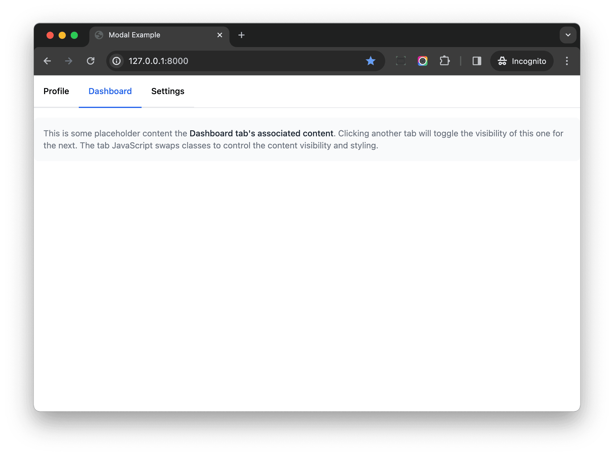
Congratulations! You've built a reusable tab component with Stimulus and Tailwind CSS.
Thinking About Frontend Tooling
With python-webpack-boilerplate, we can work directly with frontend tools and technologies instead of working indirectly with them in the Python/Django ecosystem -- e.g.:
- django-compressor
- django-libsass
- django-tailwind
- django-browser-reload
- ...
Put another way, with python-webpack-boilerplate, you can install the frontend tools directly via npm and then wire them up in the configuration files. It's a bit more work to get things up and running, but you now have much more flexibility, especially as your project grows.
Conclusion
In this tutorial, you learned how to use Stimulus and Tailwind CSS to build reusable frontend components.
Stimulus has a great ecosystem and community. Useful resources:
- tailwindcss-stimulus-components - A set of Stimulus components for Tailwind.
- stimulus-webpack-helpers - With this tool, you can just create your components and it will handle the registering of the Stimulus controllers for you.
Now, you can import frontend components into your Django templates, and they should work well. In the next tutorial, I'll show you how to reuse the component code on the server-side, and we'll create server-side components.
Series:
- Part 1 (this tutorial!) - focuses on the project setup along with the client-side
- Part 2 - focuses on the server-side