 Michael Yin
In this tutorial, we'll look at how to build server-side UI components in Django with django-viewcomponent, which can help you reuse code and keep your code clean and maintainable.
Contents
Project Setup
Django Project
Create a new project directory along with a new Django project:
$ mkdir django-component-example && cd django-component-example
$ python3.12 -m venv venv
$ source venv/bin/activate
(venv)$

(venv)$ pip install Django==5.0.3
(venv)$ django-admin startproject django_component_app .
(venv)$ python manage.py migrate
(venv)$ python manage.py runserver
Feel free to swap out virtualenv and Pip for Poetry or Pipenv. For more, review Modern Python Environments.
Navigate to http://127.0.0.1:8000/ to view the Django welcome screen. Kill the server once done.
Create a requirements.txt file and add Django as a dependency:
Django==5.0.3
Templates
Next, let's wire up a quick template.
Start by adding a new URL pattern to django_component_app/urls.py:
from django.contrib import admin
from django.urls import path
from django.views.generic import TemplateView  # new

urlpatterns = [
    path("", TemplateView.as_view(template_name="index.html")),  # new
    path("admin/", admin.site.urls),
]
Update TEMPLATES in django_component_app/settings.py so Django knows where to find the templates:
TEMPLATES = [
    {
        "BACKEND": "django.template.backends.django.DjangoTemplates",
        "DIRS": ["django_component_app/templates"],  # updated
        "APP_DIRS": True,
        "OPTIONS": {
            "context_processors": [
                "django.template.context_processors.debug",
                "django.template.context_processors.request",
                "django.contrib.auth.context_processors.auth",
                "django.contrib.messages.context_processors.messages",
            ],
        },
    },
]
Add a new folder for your templates called "templates" to the "django_component_app" folder. Then, within that folder, add an index.html file:
<!DOCTYPE html>
<html>
<head>
    <meta charset="utf-8">
    <meta name="viewport" content="width=device-width, initial-scale=1">
    <title>Bootstrap demo</title>
    <link href="https://cdn.jsdelivr.net/npm/[email protected]/dist/css/bootstrap.min.css"
          rel="stylesheet"
          integrity="sha384-rbsA2VBKQhggwzxH7pPCaAqO46MgnOM80zW1RWuH61DGLwZJEdK2Kadq2F9CUG65"
          crossorigin="anonymous">
</head>
<body>
  <div>
    <button type="button" class="btn btn-primary">Primary</button>
    <button type="button" class="btn btn-secondary">Secondary</button>
    <button type="button" class="btn btn-success">Success</button>
  </div>

  <script src="https://cdn.jsdelivr.net/npm/[email protected]/dist/js/bootstrap.bundle.min.js"
          integrity="sha384-kenU1KFdBIe4zVF0s0G1M5b4hcpxyD9F7jL+jjXkk+Q2h455rYXK/7HAuoJl+0I4"
          crossorigin="anonymous"></script>
</body>
</html>
Run the development server and navigate to http://127.0.0.1:8000/ again. You should now see three buttons, which have been styled by Bootstrap.
django-viewcomponent
As you probably already know, Bootstrap provides a number of helper CSS classes and attributes that you can use for styling. For example, for the buttons, we can change the:
- Color with
btn-primaryandbtn-secondary - Size with
btn-lgorbtn-sm
How can we make the color and size dynamic? This is where the django-viewcomponent library comes into play. We can use it to create reusable components for your Django project.
Add it to the requirements.txt file:
django-viewcomponent==1.0.5
Install:
(venv)$ pip install -r requirements.txt
Then add the app to the INSTALLED_APPS in settings.py:
INSTALLED_APPS = [
    ...
    "django_viewcomponent",
]
Modify the TEMPLATES section of settings.py like so:
TEMPLATES = [
    {
        "BACKEND": "django.template.backends.django.DjangoTemplates",
        "DIRS": ["django_component_app/templates"],
        "APP_DIRS": False,  # updated
        "OPTIONS": {
            "context_processors": [
                "django.template.context_processors.debug",
                "django.template.context_processors.request",
                "django.contrib.auth.context_processors.auth",
                "django.contrib.messages.context_processors.messages",
            ],
            "loaders":[(  # new
                "django.template.loaders.cached.Loader", [
                    "django.template.loaders.filesystem.Loader",
                    "django.template.loaders.app_directories.Loader",
                    "django_viewcomponent.loaders.ComponentLoader",
                ]
            )],
        },
    },
]
With that, we can start creating our first component!
Button Component
Create a components/button/button.py file:
from django_viewcomponent import component


@component.register("button")
class ButtonComponent(component.Component):
    template = '<button class="btn {{ self.extra_css }}" type="button">{{ self.content }}</button>'

    size_map = {
        "sm": "btn-sm",
        "lg": "btn-lg",
    }

    variant_map = {
        "primary": "btn-primary",
        "secondary": "btn-secondary",
        "success": "btn-success",
        "danger": "btn-danger",
        "warning": "btn-warning",
        "info": "btn-info",
        "light": "btn-light",
        "dark": "btn-dark",
    }

    def __init__(self, variant="primary", size=None, **kwargs):
        self.variant = variant
        self.extra_css = kwargs.get("extra_css", "")
        self.content = kwargs.get("content", "")

        if self.variant and self.variant in self.variant_map:
            self.extra_css += f" {self.variant_map[self.variant]}"

        # append css class to the extra_css
        if size and size in self.size_map:
            self.extra_css += f" {self.size_map[size]}"
Notes:
- We used
component.register("button")to register the component asbutton. - In the
__init__method, we setself.extra_cssaccording to thevariantandsizeinput. - The
templateis the inline HTML template for the button component.
Your file and folder structure should now look like this:
├── components
│   └── button
│       └── button.py
├── django_component_app
│   ├── __init__.py
│   ├── asgi.py
│   ├── settings.py
│   ├── templates
│   │   └── index.html
│   ├── urls.py
│   └── wsgi.py
├── manage.py
└── requirements.txt
Update django_component_app/templates/index.html:
{% load viewcomponent_tags %}

<!DOCTYPE html>
<html>
<head>
  <meta charset="utf-8">
  <meta name="viewport" content="width=device-width, initial-scale=1">
  <title>Bootstrap demo</title>
  <link href="https://cdn.jsdelivr.net/npm/[email protected]/dist/css/bootstrap.min.css"
        rel="stylesheet"
        integrity="sha384-rbsA2VBKQhggwzxH7pPCaAqO46MgnOM80zW1RWuH61DGLwZJEdK2Kadq2F9CUG65"
        crossorigin="anonymous">
</head>
<body>
  <div>
    {% component 'button' variant='primary' %}
      Primary
    {% endcomponent %}

    {% component 'button' variant='secondary' %}
      Secondary
    {% endcomponent %}

    {% component 'button' variant='primary' size='sm' %}
      Small button
    {% endcomponent %}

    {% component 'button' variant='primary' size='lg' %}
      Large button
    {% endcomponent %}
  </div>

  <script src="https://cdn.jsdelivr.net/npm/[email protected]/dist/js/bootstrap.bundle.min.js"
          integrity="sha384-kenU1KFdBIe4zVF0s0G1M5b4hcpxyD9F7jL+jjXkk+Q2h455rYXK/7HAuoJl+0I4"
          crossorigin="anonymous"></script>
</body>
</html>
Notes:
- We placed
{% load viewcomponent_tags %}at the top so we can use the{% component %}tag. {% component 'button' variant='primary' %}creates a button component, which we passedvariant='primary'and children ascontentto the component.- The component's
__init__method is run andtemplatewill be used to render the component.
Restart the Django server and navigate to http://127.0.0.1:8000/. You should now see:
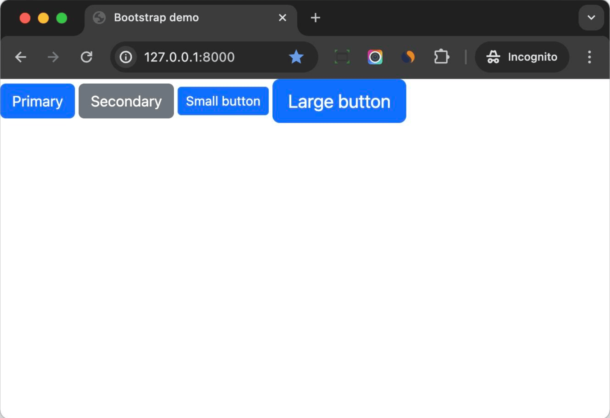
Notes:
- The button component helps us move some CSS class logic to the component level. This helps to keep our Django template clean and easy to read.
{% component 'button' variant='primary' size='lg' %}makes the component's interface more clear, making it easier to use so you don't need to refer back to the Bootstrap documentation quite as often.- If we want to switch our frontend solution to another CSS framework such as Tailwind CSS later, we can just update the component's code to get things done quickly.
Modal Component
Now that you already have a basic understanding of how to create a component using django-viewcomponent, let's dive into a more complex component -- a Modal.
Let's first take a look at the below code, copied from the Bootstrap documentation:
<!-- Button trigger modal -->
<button type="button" class="btn btn-primary" data-bs-toggle="modal" data-bs-target="#exampleModal">
  Launch demo modal
</button>

<!-- Modal -->
<div class="modal fade" id="exampleModal" tabindex="-1" aria-labelledby="exampleModalLabel" aria-hidden="true">
  <div class="modal-dialog">
    <div class="modal-content">
      <div class="modal-header">
        <h1 class="modal-title fs-5" id="exampleModalLabel">Modal title</h1>
        <button type="button" class="btn-close" data-bs-dismiss="modal" aria-label="Close"></button>
      </div>
      <div class="modal-body">
        ...
      </div>
      <div class="modal-footer">
        <button type="button" class="btn btn-secondary" data-bs-dismiss="modal">Close</button>
        <button type="button" class="btn btn-primary">Save changes</button>
      </div>
    </div>
  </div>
</div>
I've seen many Django developers copy and paste the above code directly into their Django templates and then update the code to fit their needs. While this can work, it's not a good practice when your application has several modals. So, let's create a modal component that a developer can simply pass the title and body to. This will be much cleaner and easier to read.
components/modal/modal.py:
from django_viewcomponent import component
from django_viewcomponent.fields import RendersOneField


@component.register("modal")
class ModalComponent(component.Component):
    modal_trigger = RendersOneField()
    modal_body = RendersOneField(required=True)
    modal_footer = RendersOneField(required=True)

    template_name = "modal/modal.html"

    def __init__(self, modal_id, modal_title, **kwargs):
        self.modal_id = modal_id
        self.modal_title = modal_title
Notes:
- We created a
ModalComponentclass which extendscomponent.Component. - Here, we created three slot fields for the component,
modal_trigger,modal_body, andmodal_footer. The syntax is very similar with Django model fields. modal_triggeris optional because sometimes you might need to trigger the modal in JavaScript, so we do not set it as required.- We set
template_nametomodal/modal.html, so the component will use this template to render the component. - The component will accept
modal_idandmodal_titleas required arguments.
Create the components/modal/modal.html template:
{% if self.modal_trigger.filled %}
  {{ self.modal_trigger.value }}
{% endif %}

<div class="modal fade" id="{{ self.modal_id }}" tabindex="-1" aria-labelledby="{{ self.modal_id }}Label" aria-hidden="true">
  <div class="modal-dialog">
    <div class="modal-content">
      <div class="modal-header">
        <h1 class="modal-title fs-5" id="{{ self.modal_id }}Label">{{ self.modal_title }}</h1>
        <button type="button" class="btn-close" data-bs-dismiss="modal" aria-label="Close"></button>
      </div>
      <div class="modal-body">
        {{ self.modal_body.value }}
      </div>
      <div class="modal-footer">
        {{ self.modal_footer.value }}
      </div>
    </div>
  </div>
</div>
Notes:
- We only render
modal_triggerif the slot field has been filled. - We used
{{ self.modal_body.value }}and{{ self.modal_footer.value }}to render the content of the slot fields
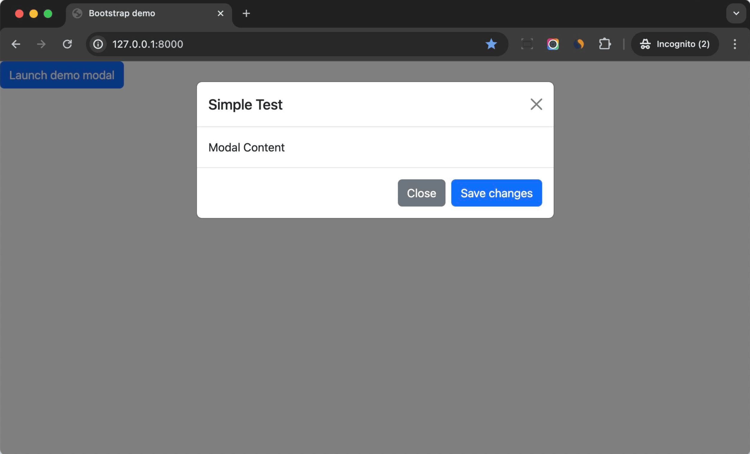
Update django_component_app/templates/index.html like so:
{% load viewcomponent_tags %}

<!DOCTYPE html>
<html>
<head>
  <meta charset="utf-8">
  <meta name="viewport" content="width=device-width, initial-scale=1">
  <title>Bootstrap demo</title>
  <link href="https://cdn.jsdelivr.net/npm/[email protected]/dist/css/bootstrap.min.css"
        rel="stylesheet"
        integrity="sha384-rbsA2VBKQhggwzxH7pPCaAqO46MgnOM80zW1RWuH61DGLwZJEdK2Kadq2F9CUG65"
        crossorigin="anonymous">
</head>
<body>
  <div>
    {% with modal_id='example' modal_title='Simple Test'%}
      {% component 'modal' modal_id=modal_id modal_title=modal_title as modal_comp %}
        {% call modal_comp.modal_trigger %}
          <button type="button" class="btn btn-primary" data-bs-toggle="modal" data-bs-target="#{{ modal_id }}">
            Launch demo modal
          </button>
        {% endcall %}
        {% call modal_comp.modal_body %}
          Modal Content
        {% endcall %}
        {% call modal_comp.modal_footer %}
          <button type="button" class="btn btn-secondary" data-bs-dismiss="modal">Close</button>
          <button type="button" class="btn btn-primary">Save changes</button>
        {% endcall %}
      {% endcomponent %}
    {% endwith %}
  </div>

  <script src="https://cdn.jsdelivr.net/npm/[email protected]/dist/js/bootstrap.bundle.min.js"
          integrity="sha384-kenU1KFdBIe4zVF0s0G1M5b4hcpxyD9F7jL+jjXkk+Q2h455rYXK/7HAuoJl+0I4"
          crossorigin="anonymous"></script>
</body>
</html>
Notes:
- We set
modal_idandmodal_titlein thewithblock. - We passed the value to the modal component.
- We used slot fields to pass HTML content to the component. This makes the code more clear and easy to understand.
Next, you can update the modal component to make it support more features. For example:
- Use
sizeto control the size of the modal. - Determine if the modal should include a modal backdrop element.
- Determine if the modal can be closed via the ESC key.
You can benefit from Object-Oriented Programming and create a highly customizable and reusable modal component.
If we keep updating the above button component then we can even write code like this:
{% with modal_id='example' modal_title='Simple Test'%}
  {% component 'modal' modal_id=modal_id modal_title=modal_title as modal_comp %}
    {% call modal_comp.modal_trigger %}
      {% component 'button' variant='primary' data_bs_toggle="modal" data_bs_target="#{{ modal_id }}" %}Launch demo modal{% endcomponent %}
    {% endcall %}
    {% call modal_comp.modal_body %}
      Modal Content
    {% endcall %}
    {% call modal_comp.modal_footer %}
      {% component 'button' variant='secondary' data_bs_dismiss="modal" %}Close{% endcomponent %}
      {% component 'button' variant='primary' %}Save changes{% endcomponent %}
    {% endcall %}
  {% endcomponent %}
{% endwith %}
Tabs Component
Next, let's build a tabs component.
components/tabs/tabs.py:
from django_viewcomponent import component
from django_viewcomponent.fields import RendersManyField


@component.register("tabs")
class TabsComponent(component.Component):
    tabs = RendersManyField(required=True)
    panes = RendersManyField(required=True)

    template_name = "tabs/tabs.html"

    def __init__(self, tabs_id, **kwargs):
        self.tabs_id = tabs_id
Here, we used RendersManyField because we want the tabs and panes to accept a collection of items.
Add the components/tabs/tabs.html template:
<ul class="nav nav-tabs" id="{{ self.tabs_id }}" role="tablist">
  {% for tab in self.tabs.value %}
    <li class="nav-item" role="presentation">
      <button class="nav-link {% if forloop.counter == 1 %}active{% endif %}" id="{{ self.tabs_id }}-tab-{{ forloop.counter }}"
              data-bs-toggle="tab"
              data-bs-target="#{{ self.tabs_id }}-tab-pane-{{ forloop.counter }}"
              type="button"
              role="tab"
              aria-controls="home-tab-pane"
              aria-selected="true">
        {{ tab }}
      </button>
    </li>
  {% endfor %}
</ul>

<div class="tab-content" id="{{ self.tabs_id }}Content">
  {% for pane in self.panes.value %}
    <div class="tab-pane fade {% if forloop.counter == 1 %}show active{% endif %}"
         id="{{ self.tabs_id }}-tab-pane-{{ forloop.counter }}"
         role="tabpanel"
         aria-labelledby="profile-tab"
         tabindex="0">
      {{ pane }}
    </div>
  {% endfor %}
</div>
We used {% for tab in self.tabs.value %} to loop through the tabs collection and get the value.
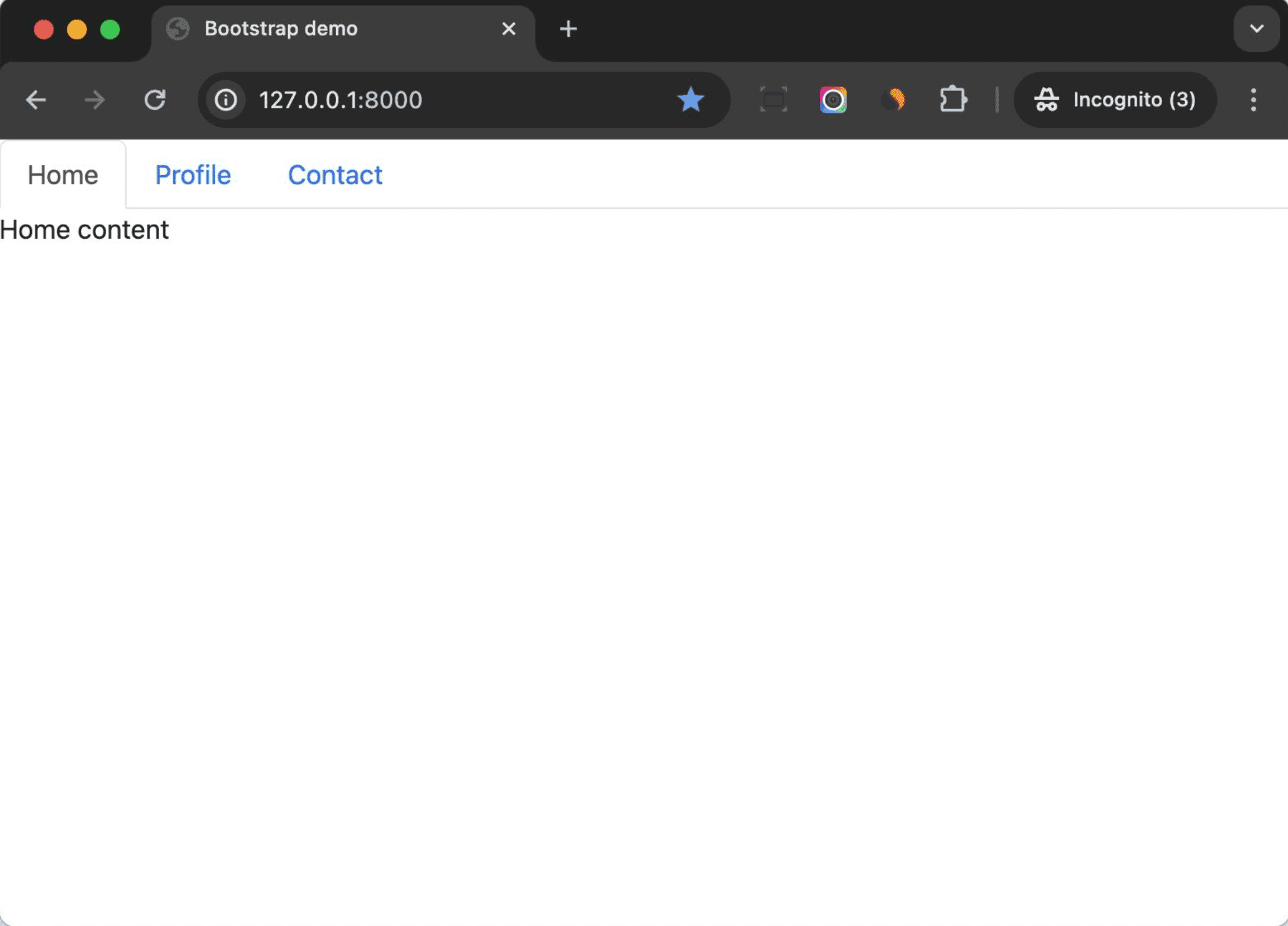
Next, add the following HTML to django_component_app/templates/index.html:
{% component 'tabs' tabs_id='exampleTab' as tabs_comp %}
  {% call tabs_comp.tabs %}
    Home
  {% endcall %}
  {% call tabs_comp.panes %}
    <div>Home content</div>
  {% endcall %}

  {% call tabs_comp.tabs %}
    Profile
  {% endcall %}
  {% call tabs_comp.panes %}
    <div>Profile content</div>
  {% endcall %}

  {% call tabs_comp.tabs %}
    Contact
  {% endcall %}
  {% call tabs_comp.panes %}
    <div>Contact content</div>
  {% endcall %}
{% endcomponent %}
We put the tab content and the respective panes content together, to make the code more readable.
Previewing Components
Up until now, we edited and checked our components by editing the index template file.
During development, developers might want to test the component in an isolated environment, without touching the Django views or URLs.
Fortunately, django-viewcomponent provides a preview mode to let us build and preview the component in an isolated environment.
Let's see how it works.
Add the following to the settings file:
VIEW_COMPONENTS = {
    "preview_base": ["previews"],
    "show_previews": DEBUG,
}
Notes:
preview_baseis the base path for your previews.show_previewsis a boolean value, which is used to control whether to show the previews or not. Here, we set it with same value ofDEBUG. So, the previews will only be shown in the development environment.
Update django_component_app/urls.py:
from django.contrib import admin
from django.urls import path, include  # updated
from django.views.generic import TemplateView

urlpatterns = [
    path("", TemplateView.as_view(template_name="index.html")),
    path("previews/", include("django_viewcomponent.urls")),  # new
    path("admin/", admin.site.urls),
]
Create a new template called django_component_app/templates/django_viewcomponent/preview.html:
<!DOCTYPE html>
<html lang="en">
<head>
  <meta charset="UTF-8">
  <meta http-equiv="X-UA-Compatible" content="IE=edge">
  <meta name="viewport" content="width=device-width, initial-scale=1.0">
  <link rel="stylesheet" href="https://cdn.jsdelivr.net/npm/[email protected]/themes/prism.min.css">
  <link href="https://cdn.jsdelivr.net/npm/[email protected]/dist/css/bootstrap.min.css"
        rel="stylesheet"
        integrity="sha384-rbsA2VBKQhggwzxH7pPCaAqO46MgnOM80zW1RWuH61DGLwZJEdK2Kadq2F9CUG65"
        crossorigin="anonymous">
</head>
<body>
  <div>
    {{ preview_html }}
  </div>

  <div class="view-component-source-example">
    <h2>Source:</h2>
    <pre><code class="language-python">{{ preview_source }}</code></pre>
  </div>

  <script src="https://cdn.jsdelivr.net/npm/[email protected]/prism.min.js"></script>
  <script src="https://cdn.jsdelivr.net/npm/[email protected]/components/prism-python.min.js"></script>
  <script src="https://cdn.jsdelivr.net/npm/[email protected]/dist/js/bootstrap.bundle.min.js"
          integrity="sha384-kenU1KFdBIe4zVF0s0G1M5b4hcpxyD9F7jL+jjXkk+Q2h455rYXK/7HAuoJl+0I4"
          crossorigin="anonymous"></script>
</body>
</html>
Notes:
- This template file will be used to render the component preview.
- We imported Bootstrap CSS and JS to the page to make the component work.
- Prism is used for code highlighting on the preview page.
preview_htmlis the HTML generated by the methods of the preview class.
Create a previews/modal_preview.py file:
from django.template import Context, Template
from django_viewcomponent.preview import ViewComponentPreview


class ModalComponentPreview(ViewComponentPreview):
    def default_modal(self, **kwargs):
        template = Template(
            """
            {% load viewcomponent_tags %}

            {% with modal_id='example' modal_title='Simple Test'%}
              {% component 'modal' modal_id=modal_id modal_title=modal_title as modal_comp %}
                {% call modal_comp.modal_trigger %}
                  <button type="button" class="btn btn-primary" data-bs-toggle="modal" data-bs-target="#{{ modal_id }}">
                    Launch demo modal
                  </button>
                {% endcall %}
                {% call modal_comp.modal_body %}
                  Modal Content
                {% endcall %}
                {% call modal_comp.modal_footer %}
                  <button type="button" class="btn btn-secondary" data-bs-dismiss="modal">Close</button>
                  <button type="button" class="btn btn-primary">Save changes</button>
                {% endcall %}
              {% endcomponent %}
            {% endwith %}
        """,
        )

        return template.render(Context({}))
Notes:
- We created a
ModalComponentPreviewclass, which inherits fromViewComponentPreview. - We defined a public method called
default_modal, which will be used to render the preview. default_modal is also the name of the preview, and the returned value ispreview_htmlin django_component_app/templates/django_viewcomponent/preview.html. - When the Django dev server is run, it will search files in the
preview_basepath, and render the preview by calling the methods --default_modal, in this case. - In most cases, you can create multiple methods (multiple previews) for one component to demonstrate how to use the component.
Restart the development server, and navigate to http://127.0.0.1:8000/previews. You should see the default_modal preview. Click on the link to see the preview of the component and the code:
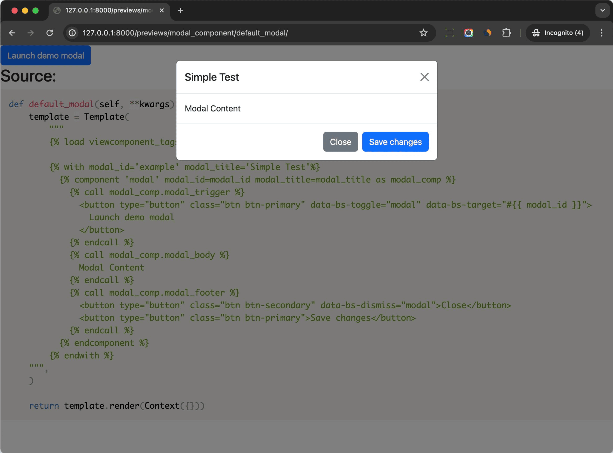
As you can see, the preview feature is very useful for us to develop and test the component in an isolated environment.
You can even build a simplified version of the component library with it.
Your file and folder structure should now look like this:
├── components
│   ├── button
│   │   └── button.py
│   ├── modal
│   │   ├── modal.html
│   │   └── modal.py
│   └── tabs
│       ├── tabs.html
│       └── tabs.py
├── django_component_app
│   ├── __init__.py
│   ├── asgi.py
│   ├── settings.py
│   ├── templates
│   │   ├── django_viewcomponent
│   │   │   └── preview.html
│   │   └── index.html
│   ├── urls.py
│   └── wsgi.py
├── manage.py
├── previews
│   └── modal_preview.py
└── requirements.txt
Frontend Assets
You can combine the server-side component solution we talked about in this tutorial with any frontend techs you're interested in. For example:
And it's recommended to put client-side logic in JavaScript files instead of the Django template files to make it easier to write tests for your client-side logic.
You can put frontend assets beside the server-side components like so:
components
└── modal
    ├── modal.js      # frontend assets
    ├── modal.css     # frontend assets
    ├── modal.html    # backend
    └── modal.py      # backend
If you want to do this, please note that the Javascript and CSS files should be processed by frontend bundling tools like Webpack or Vite. The following libraries may help:
- python-webpack-boilerplate - can help you start a project with Django and Webpack in minutes.
- django-vite - integration of Vite in a Django project.
Component Library
Is it possible to create something similar to Storybook, a frontend workshop for building UI components and pages in isolation, in Django?
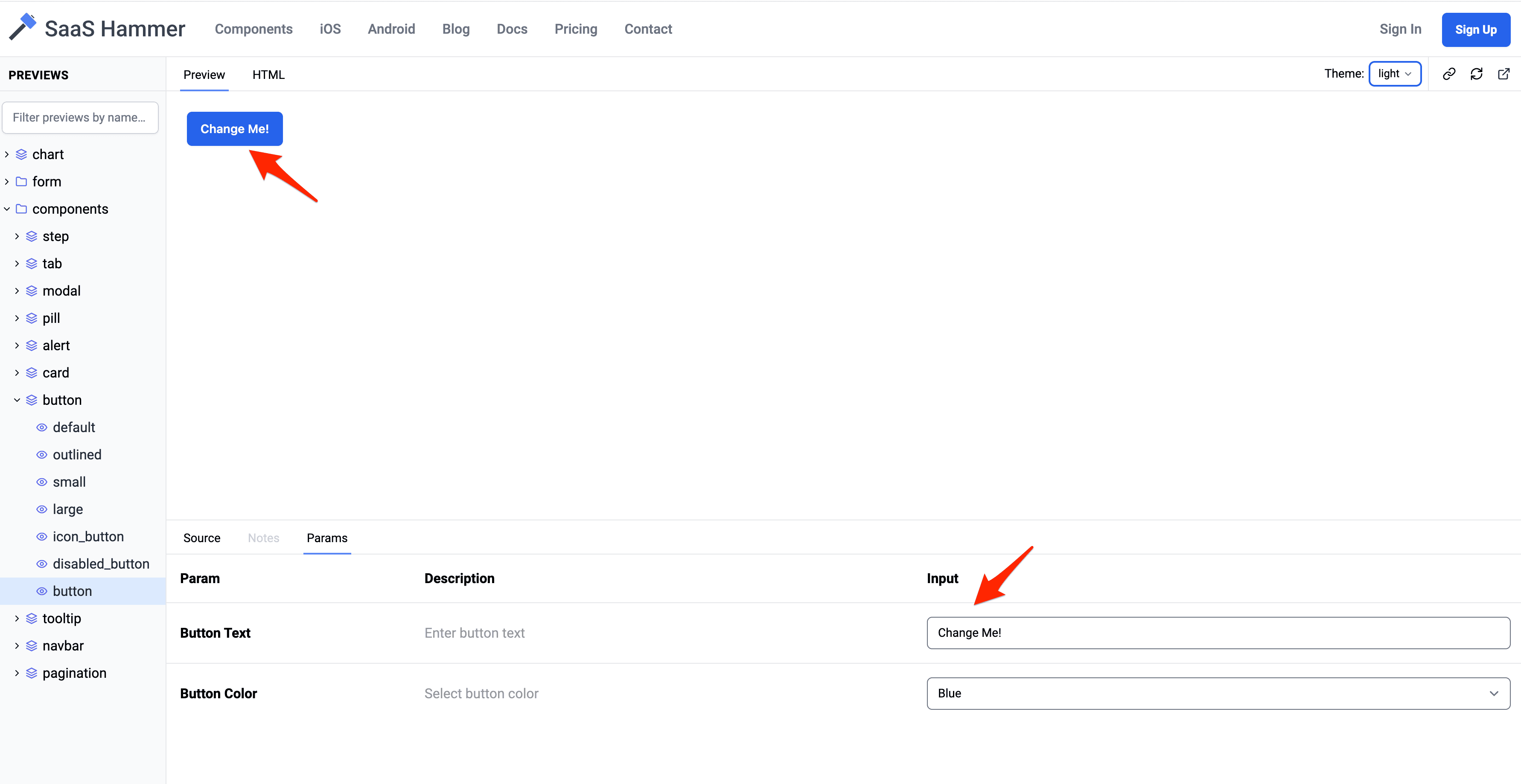
One demo you can check out is https://saashammer.com/lookbook/. This component library is developed by me, based on the django-viewcomponent package. Check out the "Params" tab for an interesting preview of what's possible. A user can update the input values to change the component's behavior:
Other Component Solutions
In this tutorial, we used django-viewcomponent as our server-side component solution, but there are other solutions if you want to check our more of what's possible:
- django-components is a very popular component solution in the Django community.
- django-slippers is yet another component solution in the Django community. It encourages developers to build components in pure Django templates, so you can see it as improved version of Django's built-in
includetag. - django-pattern-library is a UI pattern library for Django.
Resources
The following articles are written by Ruby on Rails developers. I highly recommend that you read them since it will give you a better understanding of the server-side component solution. Also, server-side components are much more mature in the Rails community.
Conclusion
In this tutorial, we looked at how to build server-side UI components in Django with the django-viewcomponent library.
The library:
- Is simple to use and won't break your existing code.
- Works with any frontend techs you're interested in.
- Can be used to build components in an isolated environment (which you can easily preview).
- Can be used to build out a component library for your project, step by step.
- Helps keep your code more maintainable, reusable, and testable.
If you have any feedback, you can create issue on the repo or DM me on Twitter/X.
Thanks for reading.